YALE SCHOOL OF ART CASE STUDY
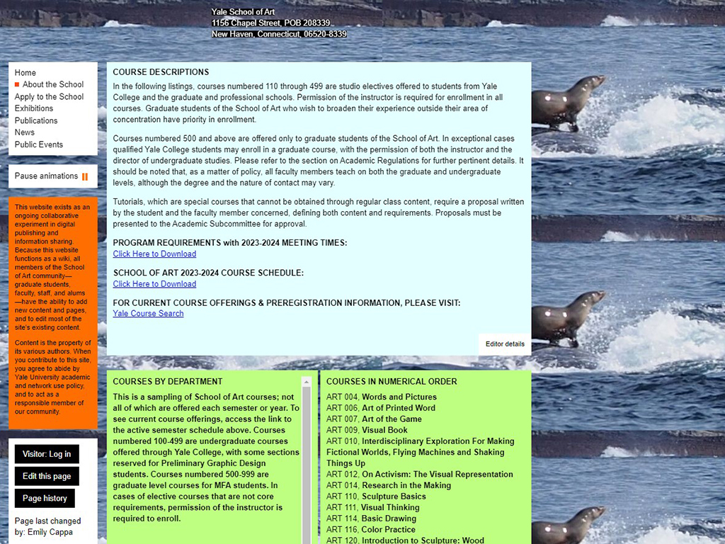
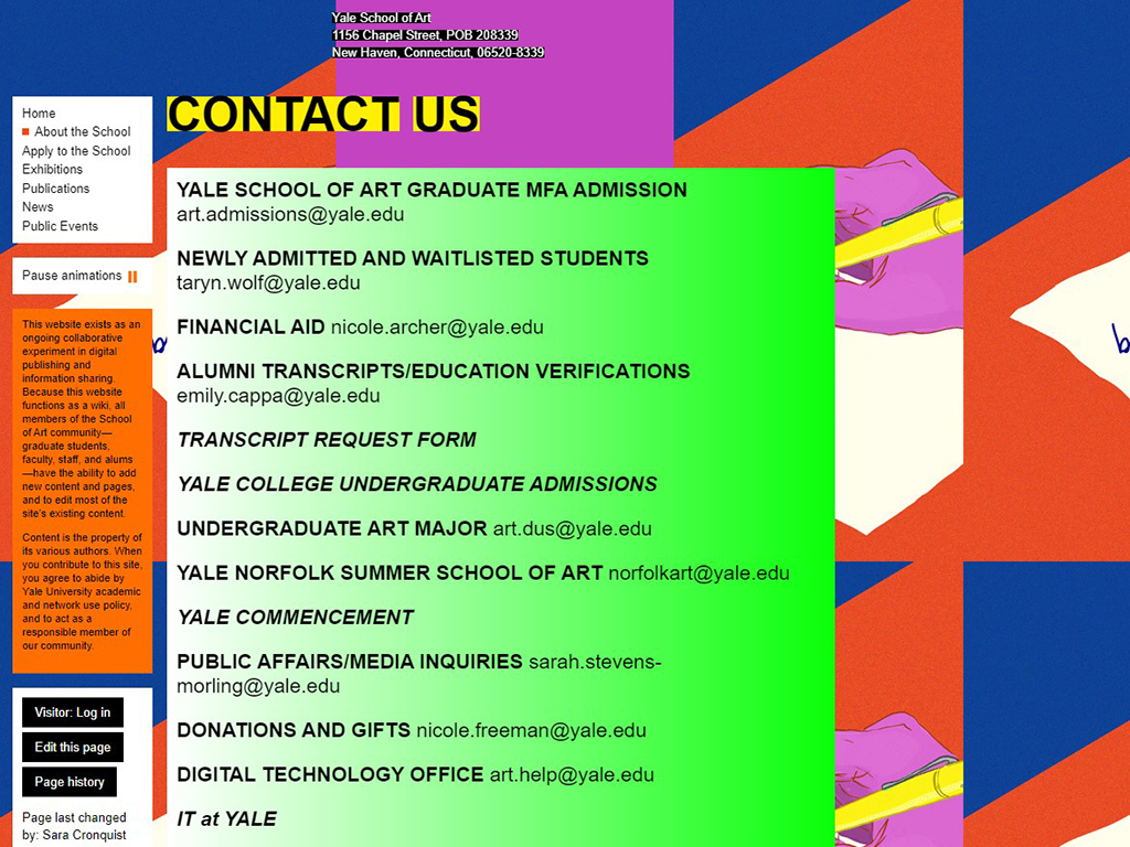
In line with UX best practices, the existing Yale School of Art website was analyzed using Nielsen’s "10 Usability Heuristics" & compared to Yale University's brand standards. This analysis, supported by peer reviews & qualitative research, identified key issues affecting user experience, trust, & reliability. It also highlighted opportunities to enhance accessibility through a site redesign.
PROJECT INFORMATION
- SKILLS: Interviews, Research, Sketching, Adobe Illustrator
- FOCUS: Accessibility, UX / UI, Web Design
- CLIENT: The Yale School of Art, GRA470
- CONTACT: Professor Elena Martignon
- PROJECT DATE: 2023
- PROJECT URL: FINAL YALE CASE STUDY REPORT PDF
BACKGROUND
ART SCHOOL SITE NEEDS BRAND-APPROPRIATE REDESIGN
In accordance with GRA470, analysis of the existing website for The Yale School of Art was to be conducted using Nielsen’s “10 Usability Heuristics.” A preliminary list of issues were identified with the existing site during a heuristic evaluation. Initial sketches were created according to these issues & tested in a small group for initial qualitative analysis. Lo-fi prototypes were created from these initial feedback studies & these prototypes were tested alongside a scripted interview, during participant interviews.
PARAMETERS
PROBLEM:
Through a heuristic evaluation, a series of goals, or research themes, were defined to redesign the site to better suit its intended audience & suggest opportunity for improvement. These goals were based on Nielsen Norman Group’s “10 Usability Heuristics for User Interface Design,” & are referenced as such throughout the document.
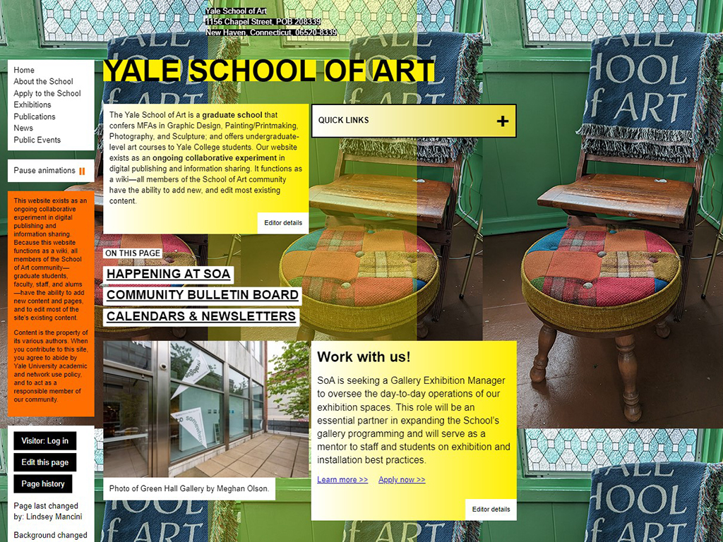
Through these core principles, poorly designed navigation, unorganized information, missing or incorrect data, & frustrating visuals (as in the current animated wallpaper gif of the site) are design flaws to be avoided, such that the best user experience can be enjoyed & fulfilling for the needs of potential & existing students, & increase the user’s overall success & happiness with using the site. Ideally, we these edits should enhance the reliability of the school (along with its reputation) & positively promote the information being presented to prospective students, resulting in more satisfied use of the website, & ultimately, enrollment in the school’s programs.
TARGET AUDIENCE:
According to online sources referenced at the report, at Yale University, the student demographic includes 38.7% White, 16.2% Asian, 10.6% Hispanic or Latino, 6.53% Black or African American, 4.92% Two or More Races, 0.249% American Indian or Alaska Native, & 0.124% Native Hawaiian or Other Pacific Islanders. The data covers both full-time & part-time, as well as graduate & undergraduate students.
In 2020, Yale awarded 2,479 degrees to men, which is about 0.92 times fewer than the 2,701 degrees awarded to women. The student age range is roughly 18 to 60 years.
Art students at Yale are active on social media platforms like Facebook, Twitter, Instagram, LinkedIn, & showcase their work on Behance. They engage in various art forms, including photography, sculpture, printmaking, & graphic arts.
Yale students are known for their attention to detail, high SAT scores, & typically complete their degrees within 100% to 150% of the expected time.
The ideal audience for this website wants easy navigation, strong design & branding, & a wealth of enrollment, degree, & student information that is easy to locate.
CONSTRAINTS:
Turn around time for project was approximately five weeks.
RESEARCH THEMES:
Goal directives being addressed with this study were as follows:
- 1.) Can you point out specific pains or problems you had while using the site?
- 2.) Was anything missing from the site that you needed or expected?
- 3.) Can you find what you need with the proposed new navigation?
- 4.) Can you find the program description(s) that suits you?
- 5.) Can you locate help for any questions or to request more info?
- 6.) Do you find the new website effective for your needs?
- 7.) Do you feel the new website design suits the Yale brand & reputation?
THEME 1: REDESIGN MAIN NAVIGATION
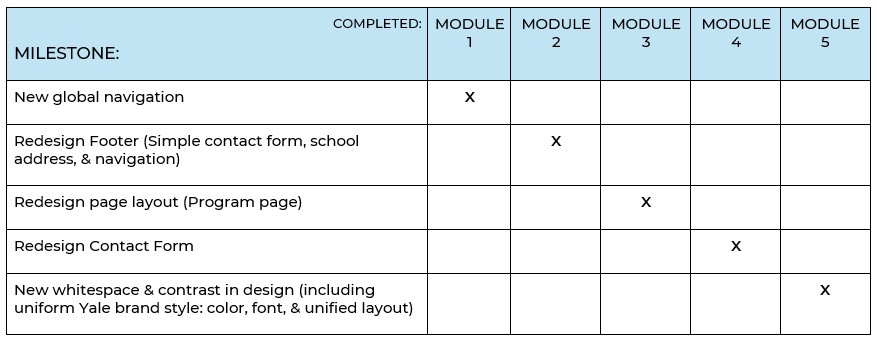
Redesigning the global header site navigation to be straightforward, uniform on all pages, easily locatable, & with a site-specific branding style (using the school logo), will allow the user immediate & easy access to all main pages of the site. Poorly structured global navigation results in brand unreliability & user confusion (“10 Usability”).
THEME 2: REDESIGN FOOTER
Redesigning the global site footer to be straightforward, uniform on all pages, easily locatable, & with a site-specific branding style, with a simple contact form for more information, will allow the user immediate & easy access to all auxiliary pages of the site, as well as ease of communication with the school. Adding the school address to this area will uncomplicate the header, as it is unnecessary in the header (where it is currently located.)
THEME 3: REDESIGN PAGE LAYOUTS (PROGRAM PAGE)
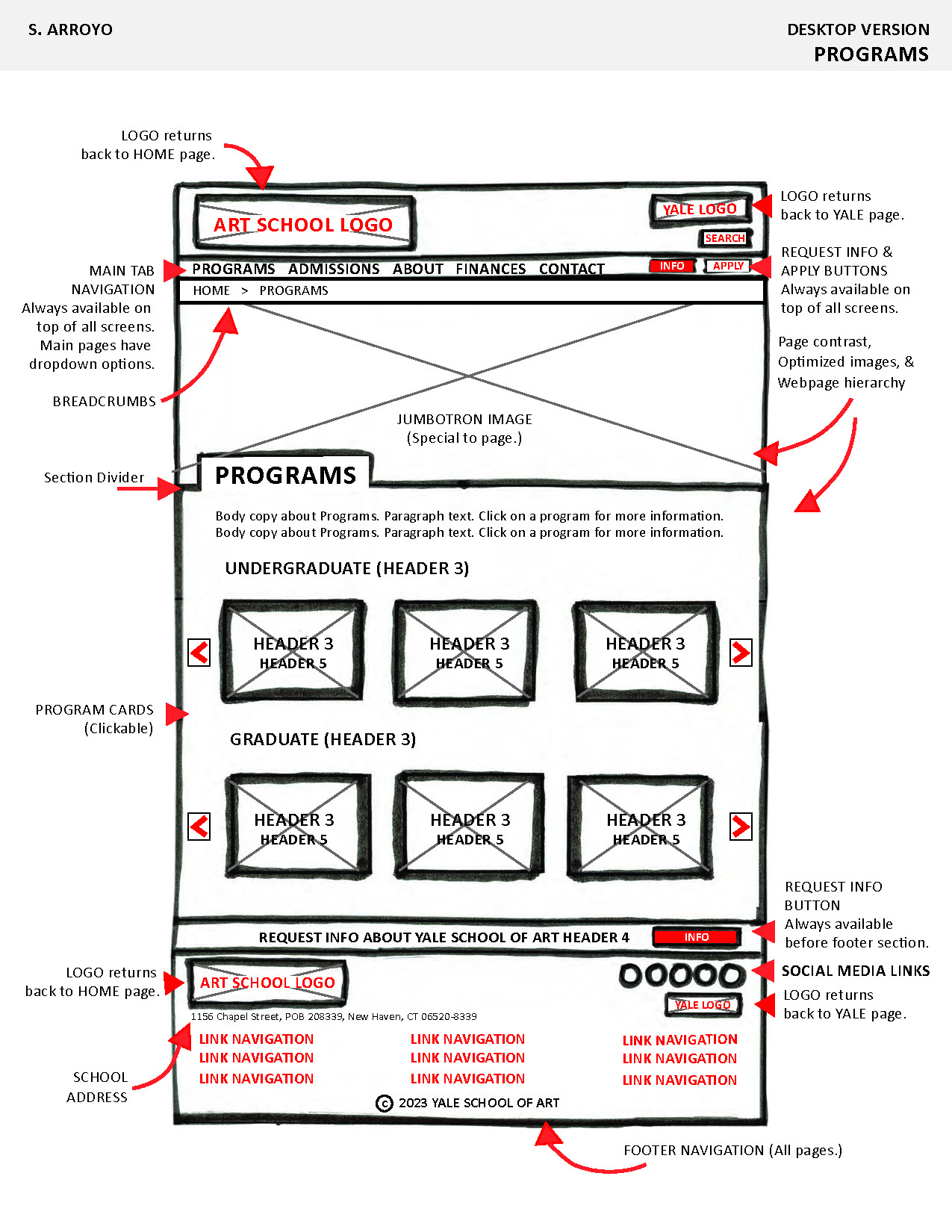
Redesigning the page body information with a hierarchy system will allow for organization of the page information, for easier understanding. Adding the site-specific branding style to the body of existing pages will allow for uniformity of the site & create a unified taxonomy system for the user to locate what is needed on the page.
THEME 4: REDESIGN CONTACT PAGE
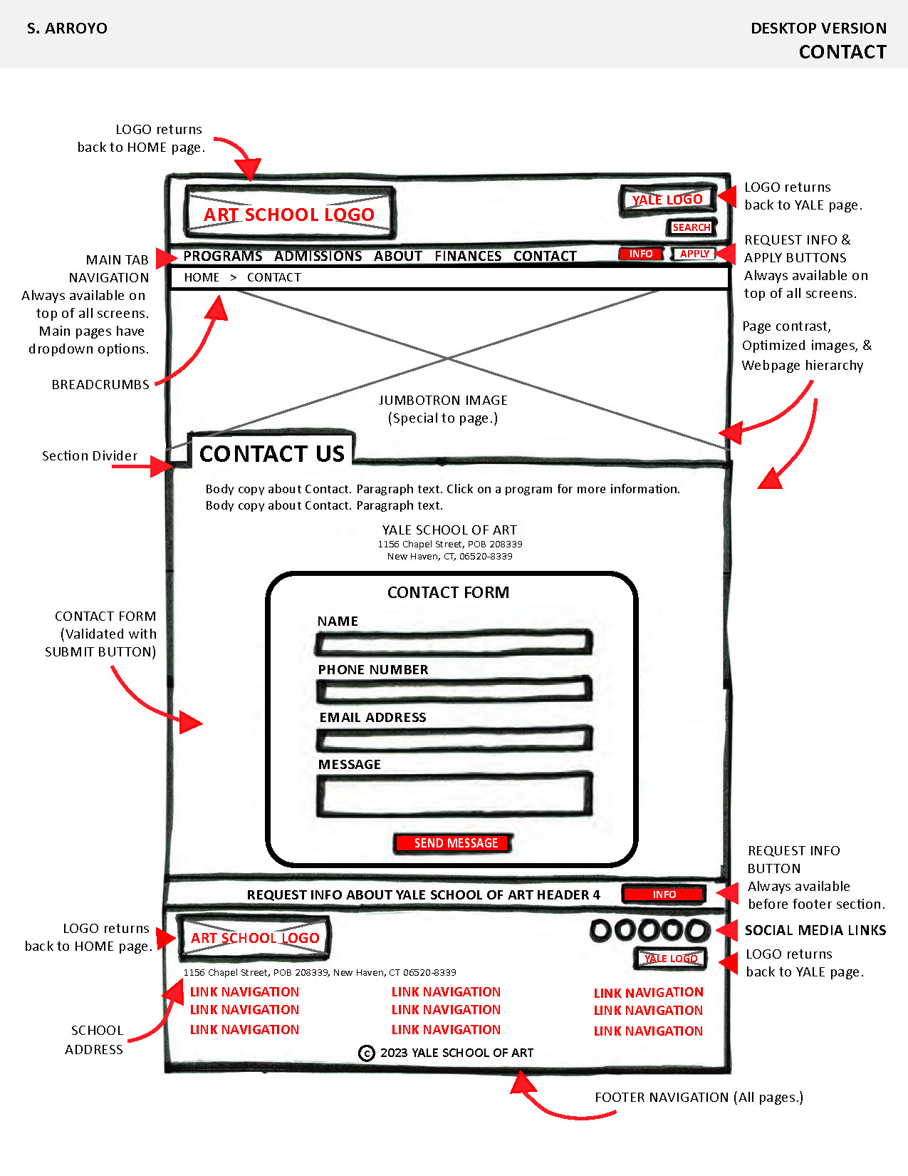
Redesigning the Contact page & form will allow for a more cohesive experience, with less frustration from the user. Better placement to easily find this form for more information or assistance, on all pages of the site, will also enhance the overall user experience.
THEME 5: REDESIGN WHITESPACE, BRAND STYLING, & IMAGERY
Redesigning the whitespace balance, contrast styling, branding, & imagery for the site will allow for a better overall user experience. This will create a higher expectation for the brand, as this is a prestigious school, garnering a reflective tuition. This redesign will allow for a more cohesive experience, with less frustration from the user. Better imagery placement may also enhance the user experience.
TASKS:
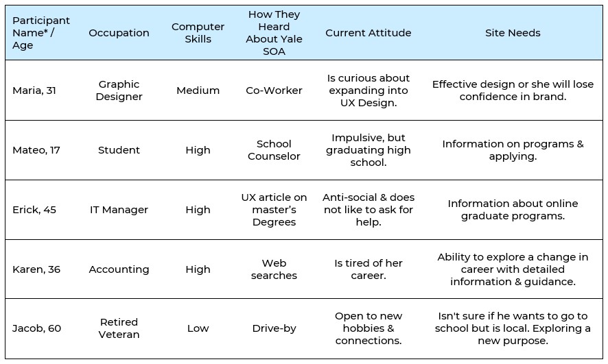
Initial tasks included a heuristics evaluation based on Nielsen's principles in "10 Usability Heuristics." These insights were evaluated by a peer group & lo-fi prototypes were initiated for qualitative interviews. Five participants were interviewed addressing site issues & asked to perform two site tasks. Personas & motivational scenarios were created and prototypes were fruther developed. These prototypes were annotated & taken to stakeholders to address needs in improvements for the site's redesign.
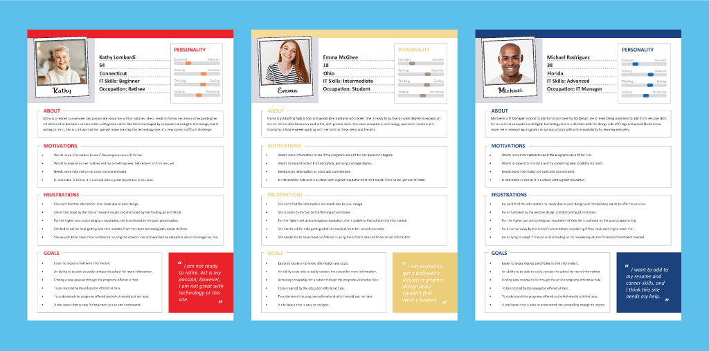
IMAGE OF PERSONAS FROM FINAL REPORT
METHODOLOGY
SCHEDULE:
TESTING & DEFENSE:
In redesigning the Yale School of Art website, justifying UX decisions was crucial. The initial research for this study involved a heuristics evaluation on the current site using Nielsen’s “10 Usability Heuristics” to identify major issues & these issues were addressed with a small focus group for feedback. Key problems were discussed, including poor visibility of system status, inconsistent design, lack of user control, & aesthetic clutter.
COMPLIANCE & DESIGN:
To address these usability issues, user personas were created, & motivational scenarios helped guide the redesign from initial feedback on the issues with the existing site design. Major findings from usability participant interview testing highlighted that navigation was unclear, page hierarchy was lacking, & there was no easy-to-find contact form or help. This feedback led to the development of low-fidelity prototypes for participant interview testing, per Nielsen’s recommendations.
PARTICIPANT DATA:
RECOMMENDATIONS
CONCLUSIONS
The following Nielsen Recommendations were uncovered via peer group testing & participant interviews. Following these guidelines would greatly improve the overall function, accessibility, & user experience of The Yale School of Art.
RESPONSIVENESS & ACCESSIBILITY
The redesigned site featured a cohesive UI with improved readability & reduced errors. Imagery was optimized & included accessibility features such as “alt” text for images. A responsive design with a mobile-friendly menu & system-compatible fonts ensured accessibility across various devices & browsers.
OVERALL OUTCOME
The redesign resulted in a more user-friendly & visually appealing site that aligned with best practices & accessibility standards, ultimately enhancing the overall user experience.
INSIGHTS
Four major topics emerged from this study:
DESIGN REQUIREMENTS
Effective design requirements that emerged from this study:
RESULTS
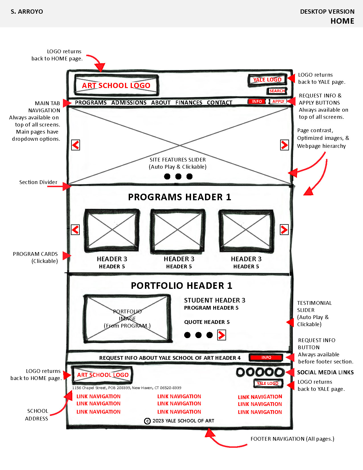
IMAGES OF ANNOTATED PROTOTYPES (DESKTOP VERSION: HOMEPAGE, PROGRAM PAGE, CONTACT PAGE)
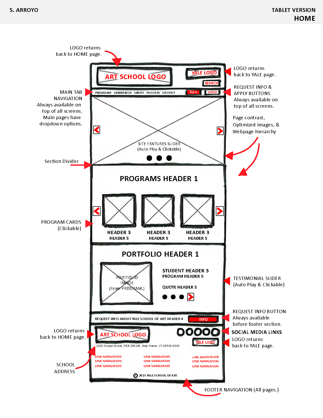
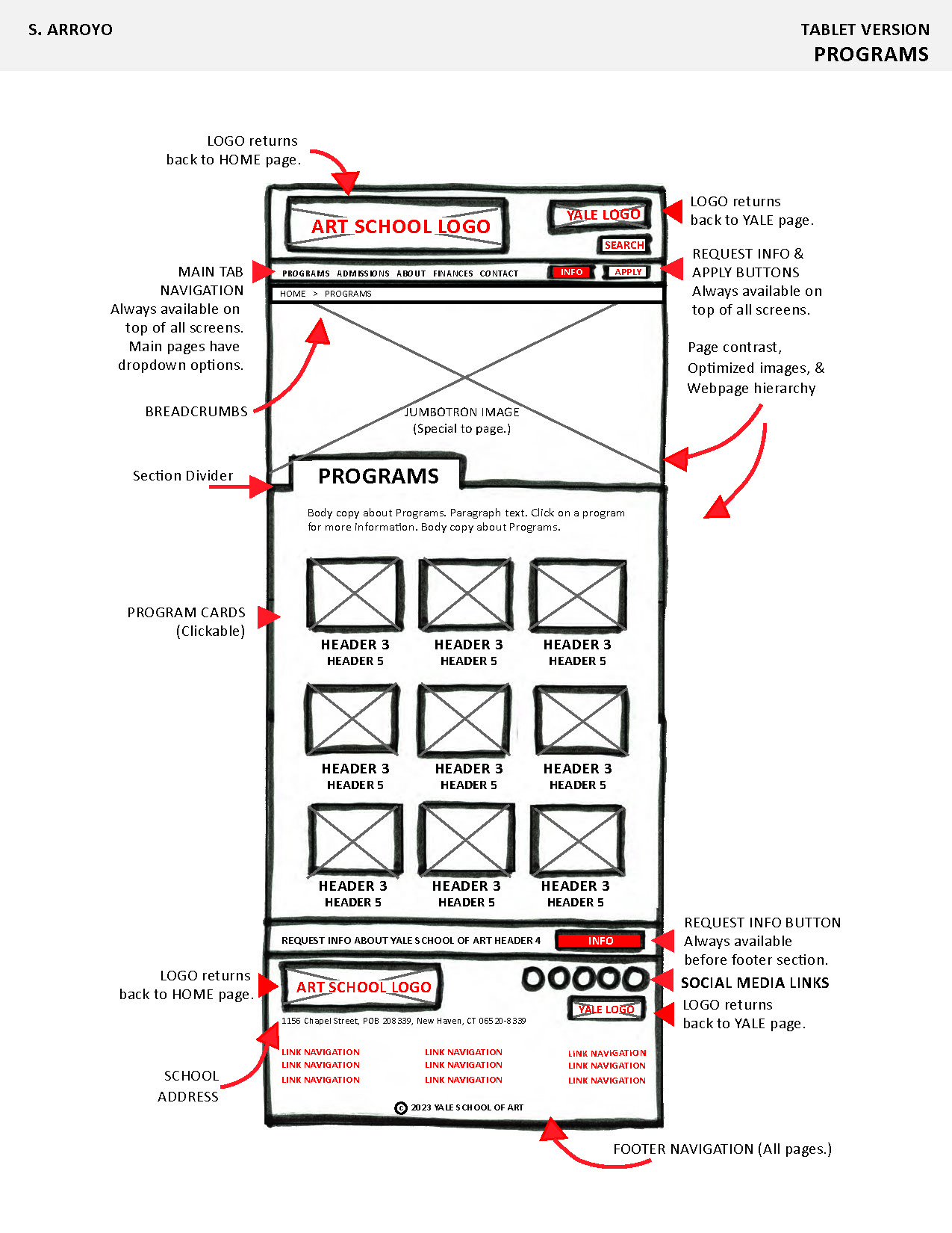
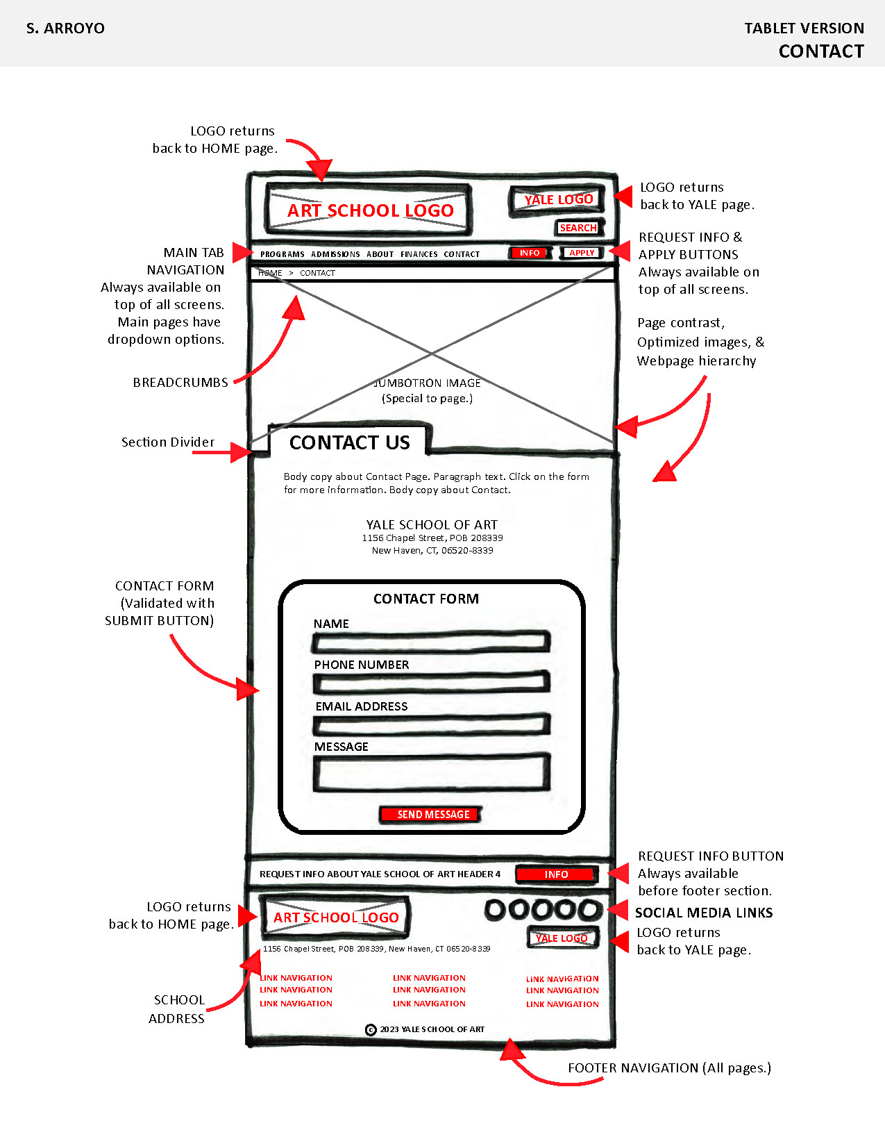
IMAGES OF ANNOTATED PROTOTYPES (TABLET VERSION: HOMEPAGE, PROGRAM PAGE, CONTACT PAGE)
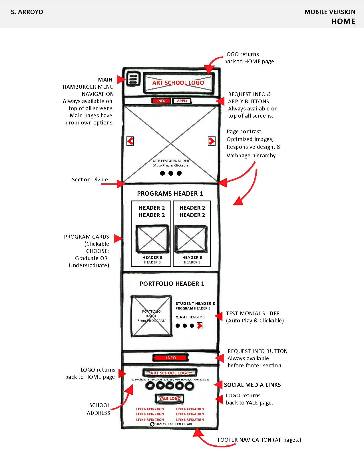
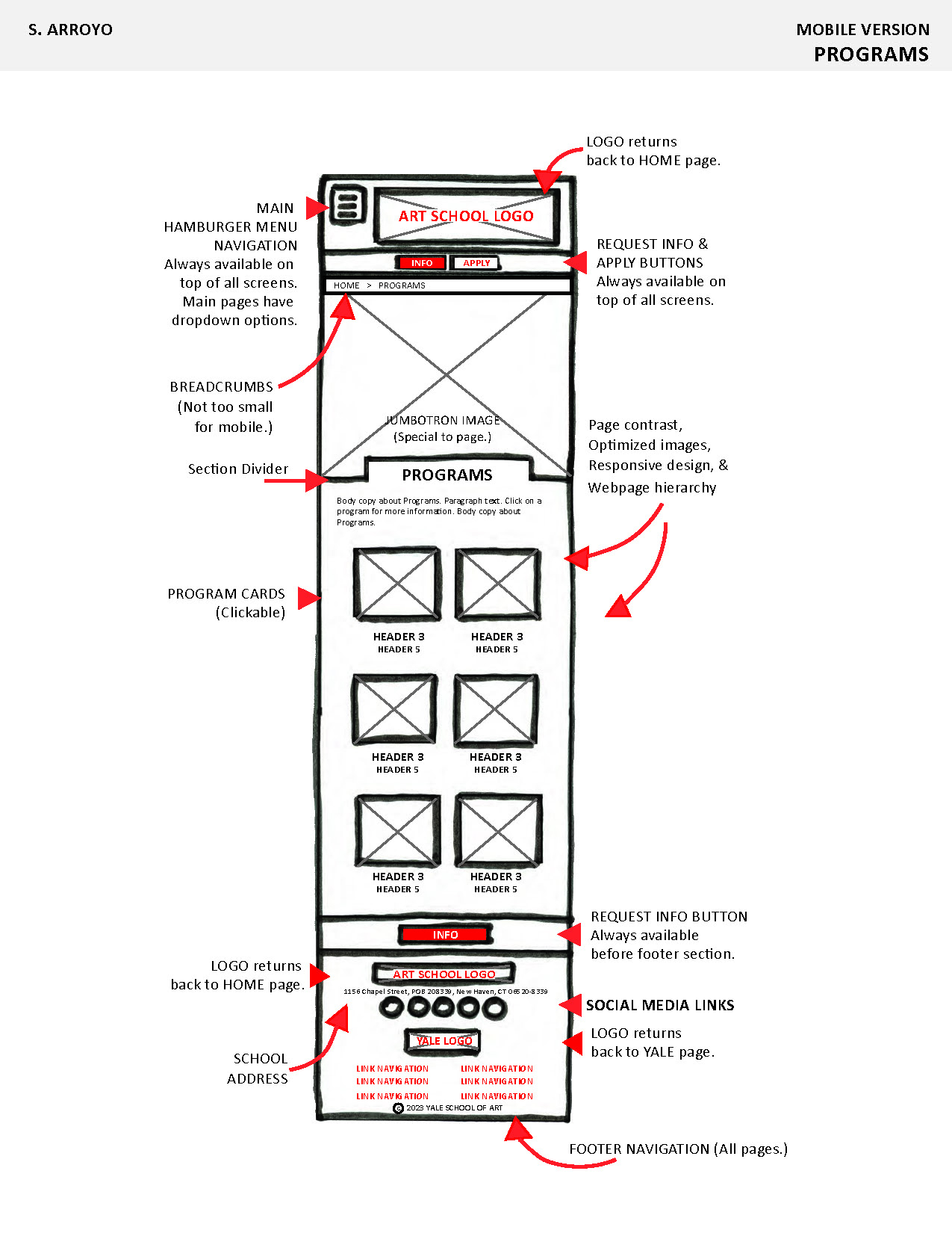
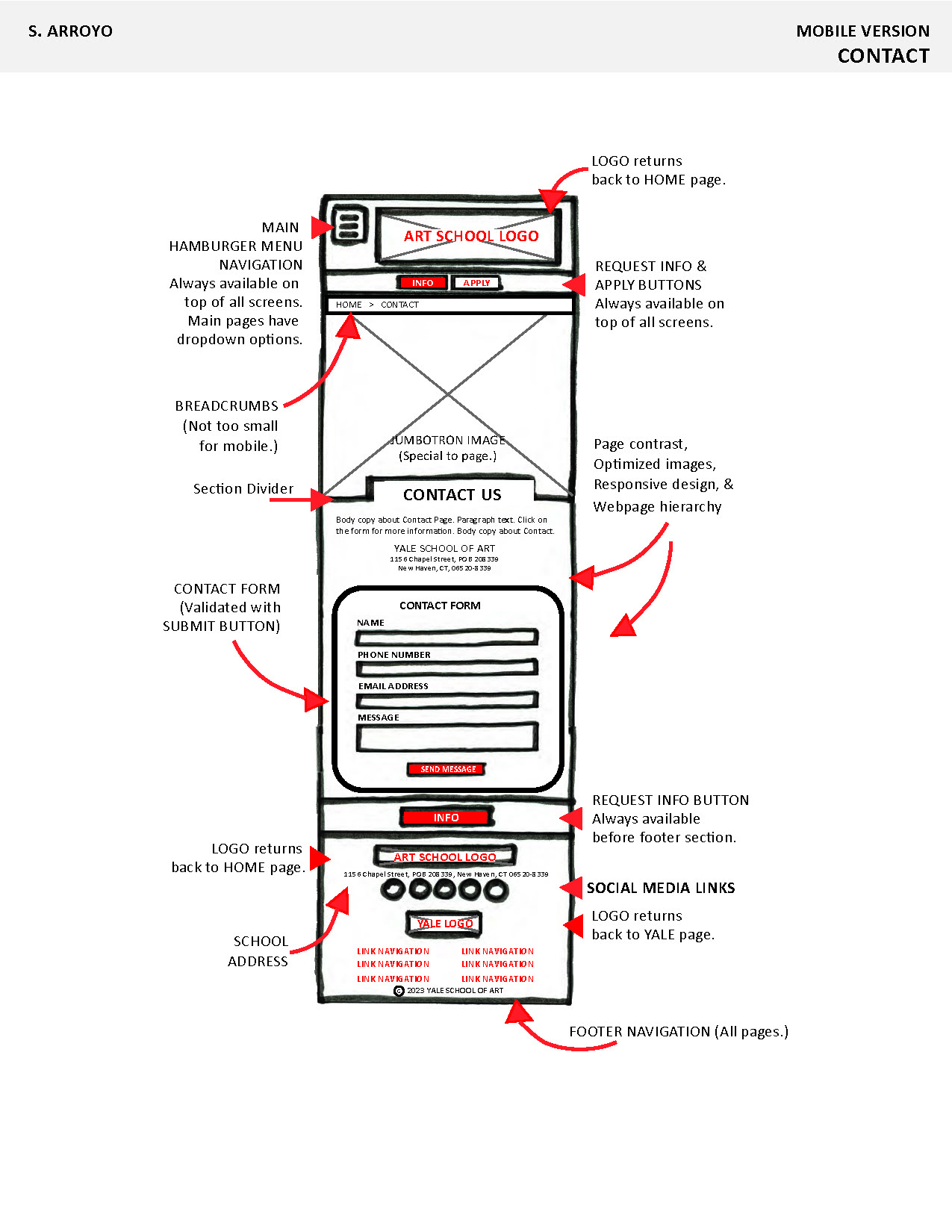
IMAGES OF ANNOTATED PROTOTYPES (MOBILE VERSION: HOMEPAGE, PROGRAM PAGE, CONTACT PAGE)
