RESPONSIVE HOMEPAGE DESIGN
BACKGROUND
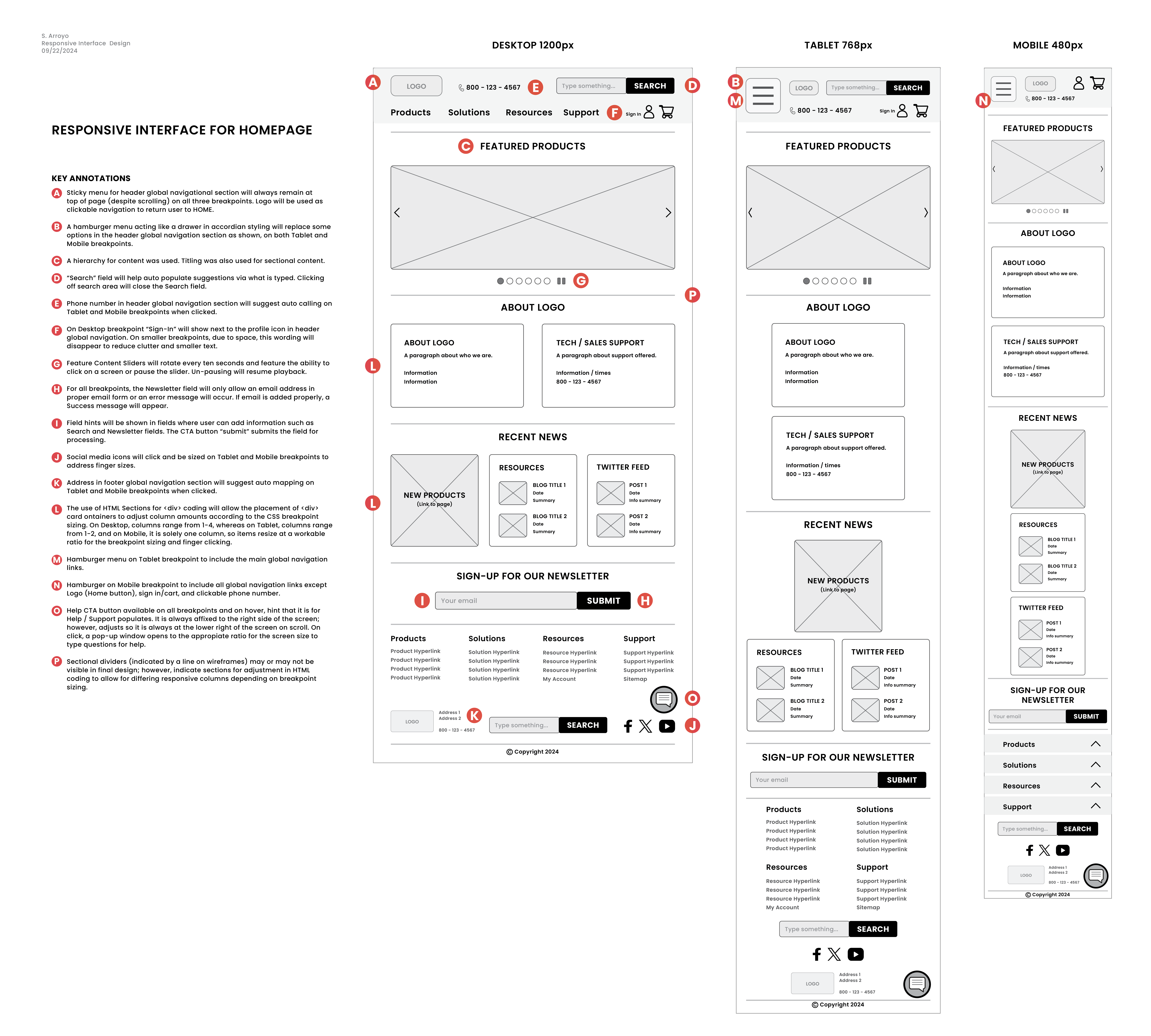
Utilizing the principles of responsive design & the conventions for reading on a website, the assignment required diagramming a homepage for each major breakpoint: desktop, tablet (vertical), & phone (vertical), with appropriate annotations to devlop the design.
PARAMETERS
SKILLS:
Figma, Adobe InDesign
FOCUS
Accessibility, UX / UI, Responsive Web Design
CLIENT:
UXD60102: Principles of Interaction, Professor Kelsey Hawke
PROJECT DATE:
2024
PROJECT URL:
RESPONSIVE HOMEPAGE DESIGN PDF
PROBLEM:
The client has requested a responsive design through analyzing & redesigning the website of a B2B electronic components distribution company, making sure to emphasize key content for the page. Despite high traffic, the site has a high bounce rate, indicating visitors are leaving after viewing the homepage. Users have reported that the homepage is cluttered & difficult to navigate, making it hard to find what they need. The goal is to reorganize the homepage to create clearer pathways for users, ultimately increasing product sales. Additionally, returning customers want quicker access to the products they frequently purchase.
TARGET AUDIENCE:
The company's primary audience consists of manufacturers, retailers, & fabricators who purchase a wide range of electronic components for large-scale use or resale. While individual consumers can place orders, this occurs infrequently.
CONSTRAINTS:
Turn around time for project was two weeks, with group feedback to improve upon the homepage's responsive UI.
MY ROLE:
Assessment of best UI patterns & principles, responsive breakpoint wireframes, annotations
TASKS:
The homepage needed to be accessible on responsive breakpoints, so hierarchy & ratios of features needed to be assessed for creation of three wireframes. These features were annotated on the design's wireframe to ensure that the designer / developer creating the interactivity could follow current WCAG principles of accessibility & universal, responsive design.
The homepage needed to include the following fields: logo, primary navigation (products, solutions, resources support), account navigation (sign in, shopping cart), toll free phone number, & product search. The content section needed to include: featured content, brief company info, tech support, resource blog posts, new product area, & recent Twitter posts. The footer navigation area needed to include: copyright, contact info, social media links (Twitter, YouTube, Facebook), newsletter sign-up, site search, footer nav menu (products, solutions, resources, support, account, site map.)
KEY TAKEAWAYS:
Evaluating UI for responsivity allows for a better understanding of an audience's user & sounded design for more user-centric UX practices. Good responsivity allows for better accessibility & more responsive SEO practices. It is something everyone can appreciate (especially when accessing a form on a mobile screen) as it, at its basics, allows for less frustration from the user & reduced bounce rates, & more completed sales. Hierarchy of content size, strong screen contrast, & clearly labeled content organization, allow for a website that can be viewed by any user on any screen size. WCAG standards & strong color theory & design allow for a more successful UI design for all users.
RESULTS

IMAGE: Responsive Website Homepage Design.
KEY ANNOTATIONS SHOWN
- A. Sticky menu for header global navigational section will always remain at top of page (despite scrolling) on all three breakpoints. Logo will be used as clickable navigation to return user to HOME.
- B. A hamburger menu acting like a drawer in accordian styling will replace some options in the header global navigation section as shown, on both Tablet & Mobile breakpoints.
- C. A hierarchy for content was used. Titling was also used for sectional content.
- D. “Search” field will help auto populate suggestions via what is typed. Clicking off search area will close the Search field.
- E. Phone number in header global navigation section will suggest auto calling on Tablet & Mobile breakpoints when clicked.
- F. On Desktop breakpoint “Sign-In” will show next to the profile icon in header global navigation. On smaller breakpoints, due to space, this wording will disappear to reduce clutter & smaller text.
- G. Feature Content Sliders will rotate every ten seconds amp; feature the ability to click on a screen or pause the slider. Un-pausing will resume playback.
- H. For all breakpoints, the Newsletter field will only allow an email address in proper email form or an error message will occur. If email is added properly, a Success message will appear.
- I. Field hints will be shown in fields where user can add information such as Search & Newsletter fields. The CTA button “submit” submits the field for processing.
- J. Social media icons will click & be sized on Tablet & Mobile breakpoints to address finger sizes.
- K. Address in footer global navigation section will suggest auto mapping on Tablet & Mobile breakpoints when clicked.
- L. The use of HTML Sections for div coding will allow the placement of div card containers to adjust column amounts according to the CSS breakpoint sizing. On Desktop, columns range from 1-4, whereas on Tablet, columns range from 1-2, & on Mobile, it is solely one column, so items resize at a workable ratio for the breakpoint sizing & finger clicking.
- M. Hamburger menu on Tablet breakpoint to include the main global navigation links.
- N. Hamburger on Mobile breakpoint to include all global navigation links except Logo (Home button), sign in/cart, & clickable phone number.
- O. Help CTA button available on all breakpoints and on hover, hint that it is for Help / Support populates. It is always affixed to the right side of the screen; however, adjusts so it is always at the lower right of the screen on scroll. On click, a pop-up window opens to the appropiate ratio for the screen size to type questions for help.
- P. Sectional dividers (indicated by a line on wireframes) may or may not be visible in final design; however, indicate sections for adjustment in HTML coding to allow for differing responsive columns depending on breakpoint sizing.

