INTERACTIVE MEAL SERVICE FORM
BACKGROUND
As a designer for the municipal government, a new interactive form needs designed for a meal service. Additionally, the form needs to work across breakpoints, focusing initially on the mobile screen breakpoint.
PARAMETERS
SKILLS:
Figma, Adobe InDesign
FOCUS
Accessibility, UX / UI, Interactive App Design
CLIENT:
UXD60102: Principles of Interaction, Professor Kelsey Hawke
PROJECT DATE:
2024
PROJECT URL:
PROBLEM:
To design a new interactive form for a charity meal service. Focus for the form needs to be directed for an accessible mobile breakpoint application, with larger breakpoints (desktop & tablet) kept in mind.
TARGET AUDIENCE:
Offering meals to those in need, the audience includes a broad group, 18+ years of age and older. Also, bearing in mind the UI may be accessed by a friend, family member, or nurse, for a handicapped person in need of the service.
CONSTRAINTS:
Turn around time for project was two weeks, with group feedback to improve upon form's UI.
MY ROLE:
Assessment of best UI patterns & principles, mobile wireframe, annotations
TASKS:
The form needed to be accessible first on a mobile breakpoint, so hierarchy & ratios of features needed to be assessed. These features were annotated on the design's wireframe to ensure that the designer / developer creating the interactivity could follow current WCAG principles of accessibility & universal design.
The form needed to include the following fields: Name of person being served, name of person filling out form, age, whether or not they are disabled, which meals are needed on which days, contact information for both the person being served & the person filling out the form, & any additional information needed about the property the meals are being delivered to.
KEY TAKEAWAYS:
Evaluating UI for accessibility allows for a better understanding of an audience's user & sounded design for more user-centric UX practices. Good accessibility is something everyone can appreciate (especially when accessing a form on a mobile screen) as it, at its basics, allows for less frustration from the user & more complete & accurate form completion. For me, reduced lighting can cause a need for reading glasses, so hierarchy of content size, strong screen contrast, & clearly labeled content, play a huge role in my ability to understand a form (or app) on my mobile. WCAG standards & strong color theory & design allow for a more successful UI design for all users.
RESULTS

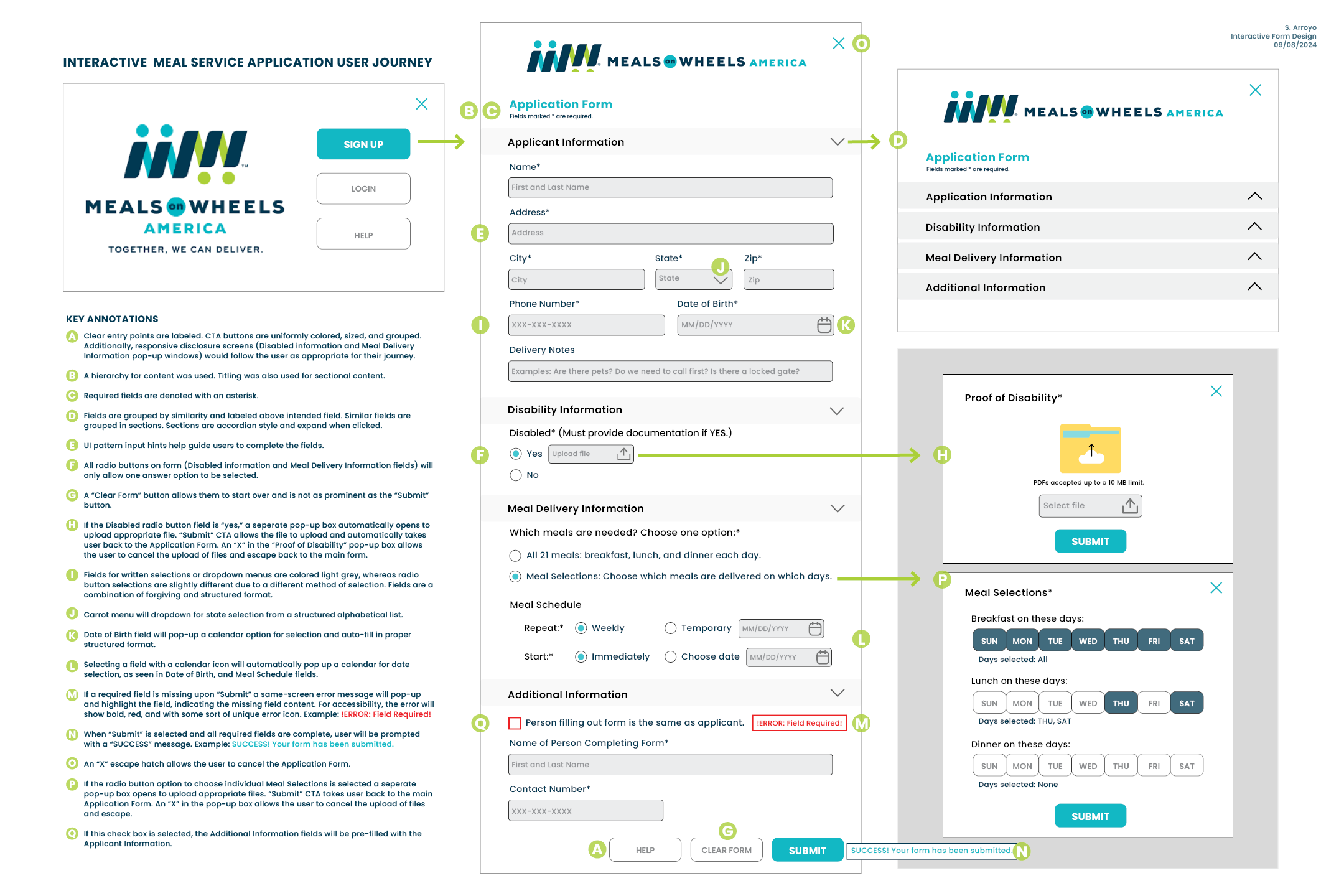
IMAGE: Interactive Meal Service Form.
KEY ANNOTATIONS SHOWN
- A. Clear entry points are labeled. CTA buttons are uniformly colored, sized, & grouped. Additionally, responsive disclosure screens (Disabled information & Meal Delivery Information pop-up windows) would follow the user as appropriate for their journey.
- B. A hierarchy for content was used. Titling was also used for sectional content.
- C. Required fields are denoted with an asterisk.
- D. Fields are grouped by similarity & labeled above intended field. Similar fields are grouped in sections. Sections are accordian style & expand when clicked.
- E. UI pattern input hints help guide users to complete the fields.
- F. All radio buttons on form (Disabled information & Meal Delivery Information fields) will only allow one answer option to be selected.
- G. A “Clear Form” button allows them to start over & is not as prominent as the “Submit” button.
- H. If the Disabled radio button field is “yes,” a seperate pop-up box automatically opens to upload appropriate file. “Submit” CTA allows the file to upload & automatically takes user back to the Application Form. An “X” in the “Proof of Disability” pop-up box allows the user to cancel the upload of files & escape back to the main form.
- I. Fields for written selections or dropdown menus are colored light grey, whereas radio button selections are slightly different due to a different method of selection. Fields are a combination of forgiving & structured format.
- J. Carrot menu will dropdown for state selection from a structured alphabetical list.
- K. Date of Birth field will pop-up a calendar option for selection & auto-fill in proper structured format.
- L. Selecting a field with a calendar icon will automatically pop up a calendar for date selection, as seen in Date of Birth, & Meal Schedule fields.
- M. If a required field is missing upon “Submit” a same-screen error message will pop-up & highlight the field, indicating the missing field content. For accessibility, the error will show bold, red, & with some sort of unique error icon. Example: !ERROR: Field Required!
- N. When “Submit” is selected & all required fields are complete, user will be prompted with a “SUCCESS” message. Example: SUCCESS! Your form has been submitted.
- O. An “X” escape hatch allows the user to cancel the Application Form.
- P. If the radio button option to choose individual Meal Selections is selected a seperate pop-up box opens to upload appropriate files. “Submit” CTA takes user back to the main Application Form. An “X” in the pop-up box allows the user to cancel the upload of files & escape.
- Q. If this check box is selected, the Additional Information fields will be pre-filled with the Applicant Information.

