PASTA AMORE BRANDING
Pasta Amore aims to create a warm, family-friendly environment where guests can enjoy traditional Italian cuisine with a modern twist. They blend classic Italian cooking with creative innovation, focusing on growing & learning alongside their customers. Their brand is built on understanding Italian culture & consumer preferences, with a commitment to fostering creativity, conversation, & high-quality experiences.
PROJECT INFORMATION
- SKILLS: Adobe InDesign, Adobe Illustrator, Adobe Photoshop
- FOCUS: Typography, Branding, Design
- CLIENT: COM232 Desktop Publishing
- CONTACT: Professor Curtis Loftis
- PROJECT DATE: 2022
- PROJECT URL: N/A
BACKGROUND
FAMILY STYLE ITALIAN USING WHOLE INGREDIENTS
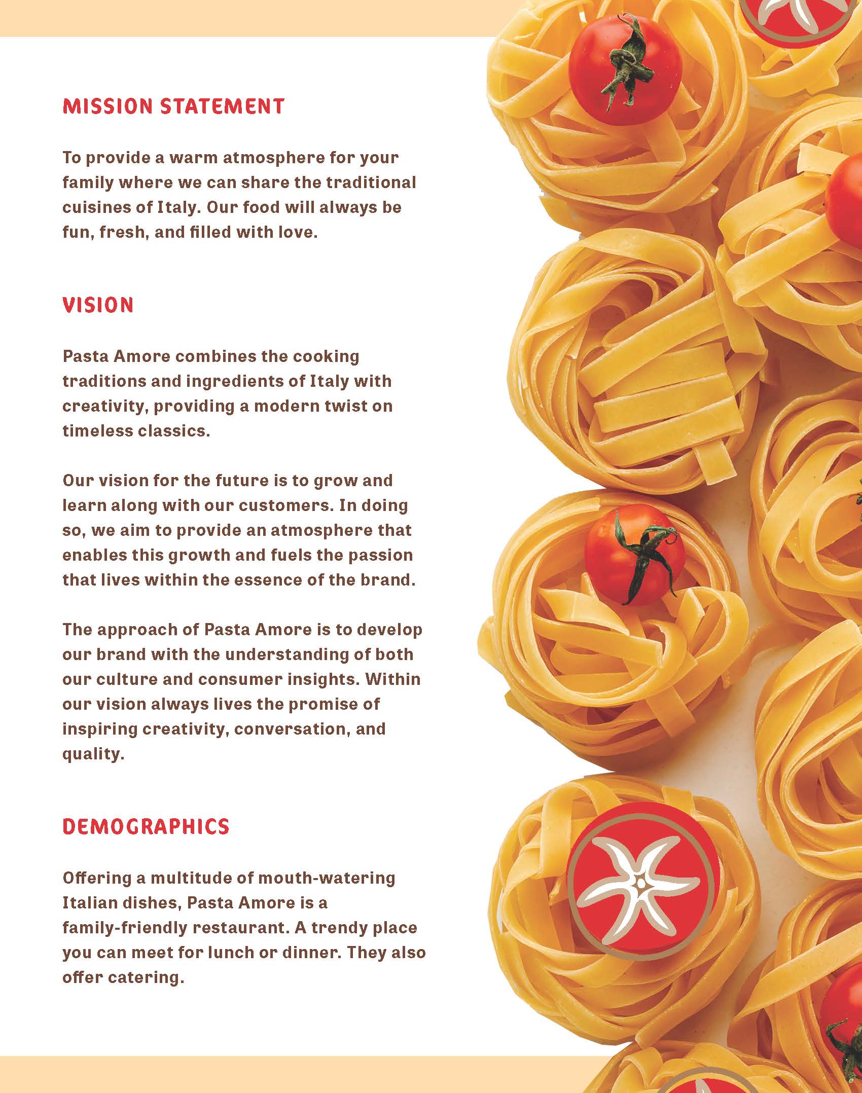
Pasta Amore’s goal is to provide a warm atmosphere for the entire family. A place that is fun & inviting, where anyone can come share the traditional cuisines of Italy.
Pasta Amore combines the cooking traditions & ingredients of Italy with creativity, providing a modern twist on timeless classics. They want to grow & learn along with their customers. In doing so, they aim to provide an atmosphere that enables this growth & fuels the passion that lives within the essence of the brand.
The approach of Pasta Amore is to develop their brand with the understanding of both the Italian culture & consumer insights. Within their vision always lives the promise of inspiring creativity, conversation, & quality.
PARAMETERS
PROBLEM:
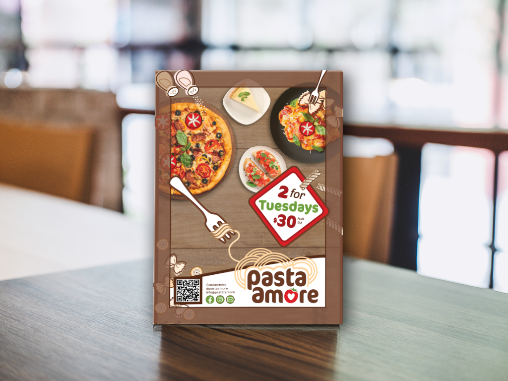
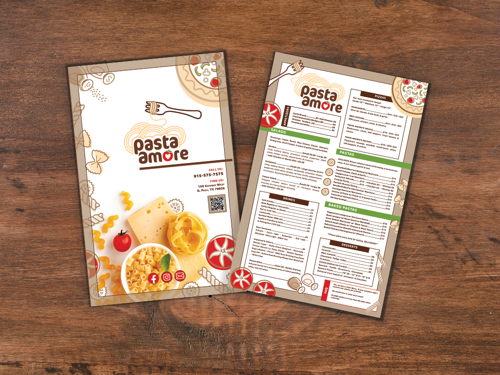
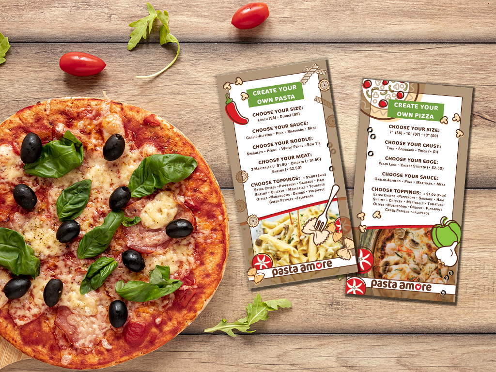
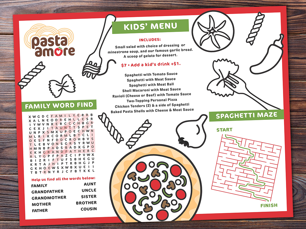
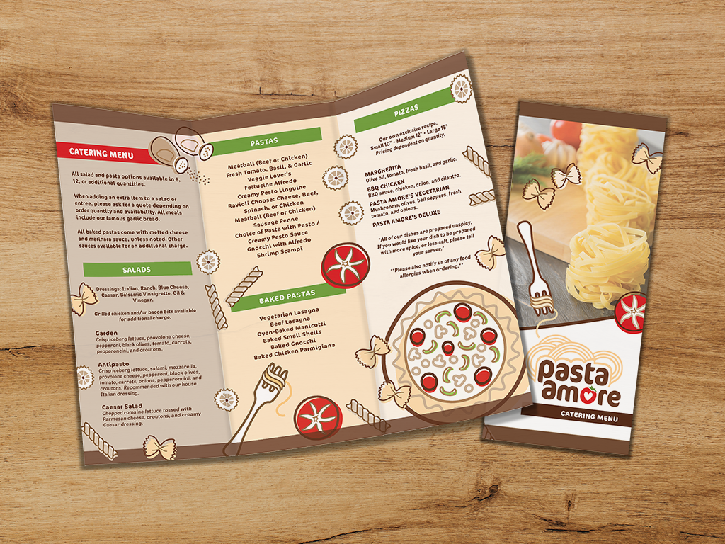
Pasta Amore desired a new logo with updated branding. After approval, they would like print-ready PDF designs for a table tent special, an adaptable menu redesign, & a catering tri-fold brochure.
TARGET AUDIENCE:
Offering a multitude of mouth-watering Italian dishes, Pasta Amore is a family-friendly restaurant. A trendy place you can meet for lunch or dinner. They also offer catering.
CONSTRAINTS:
Turn around time for project was roughly two weeks.
TASKS:
Initial audience & content analysis, logo redesign with Brand Guide (Made in Adobe Illustrator), & mock-ups made in Adobe Photoshop.
DESIGN RATIONALE:
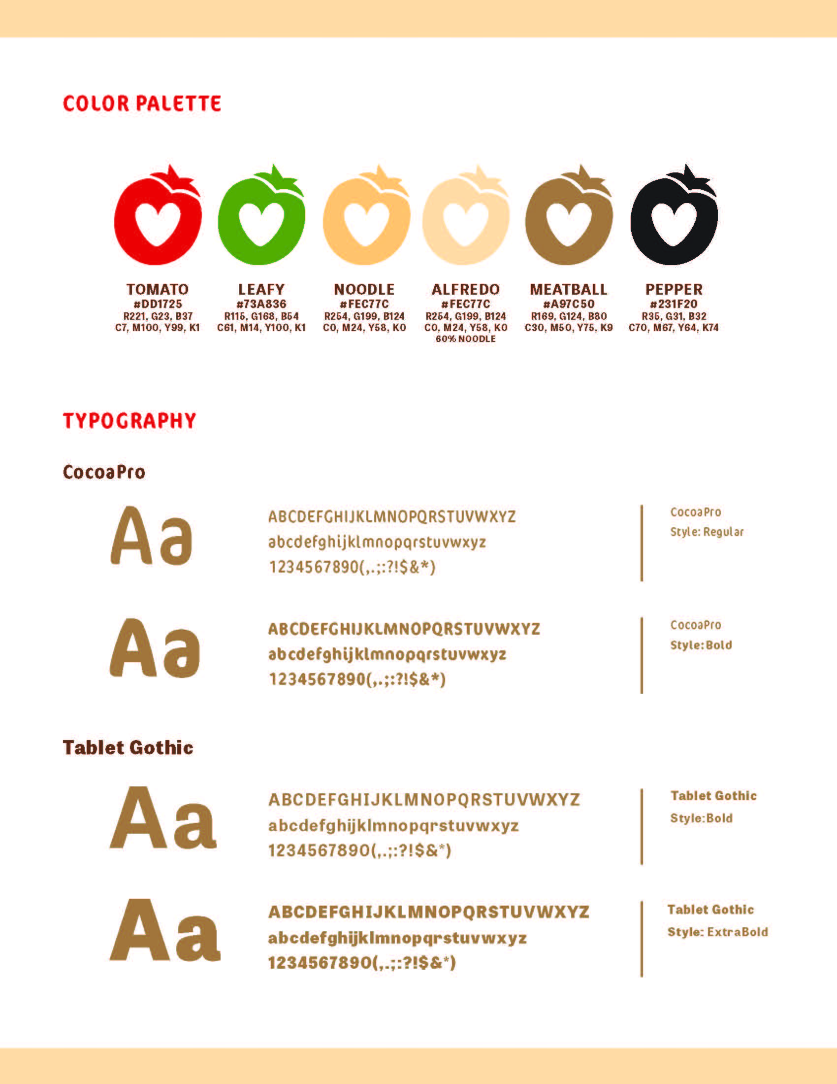
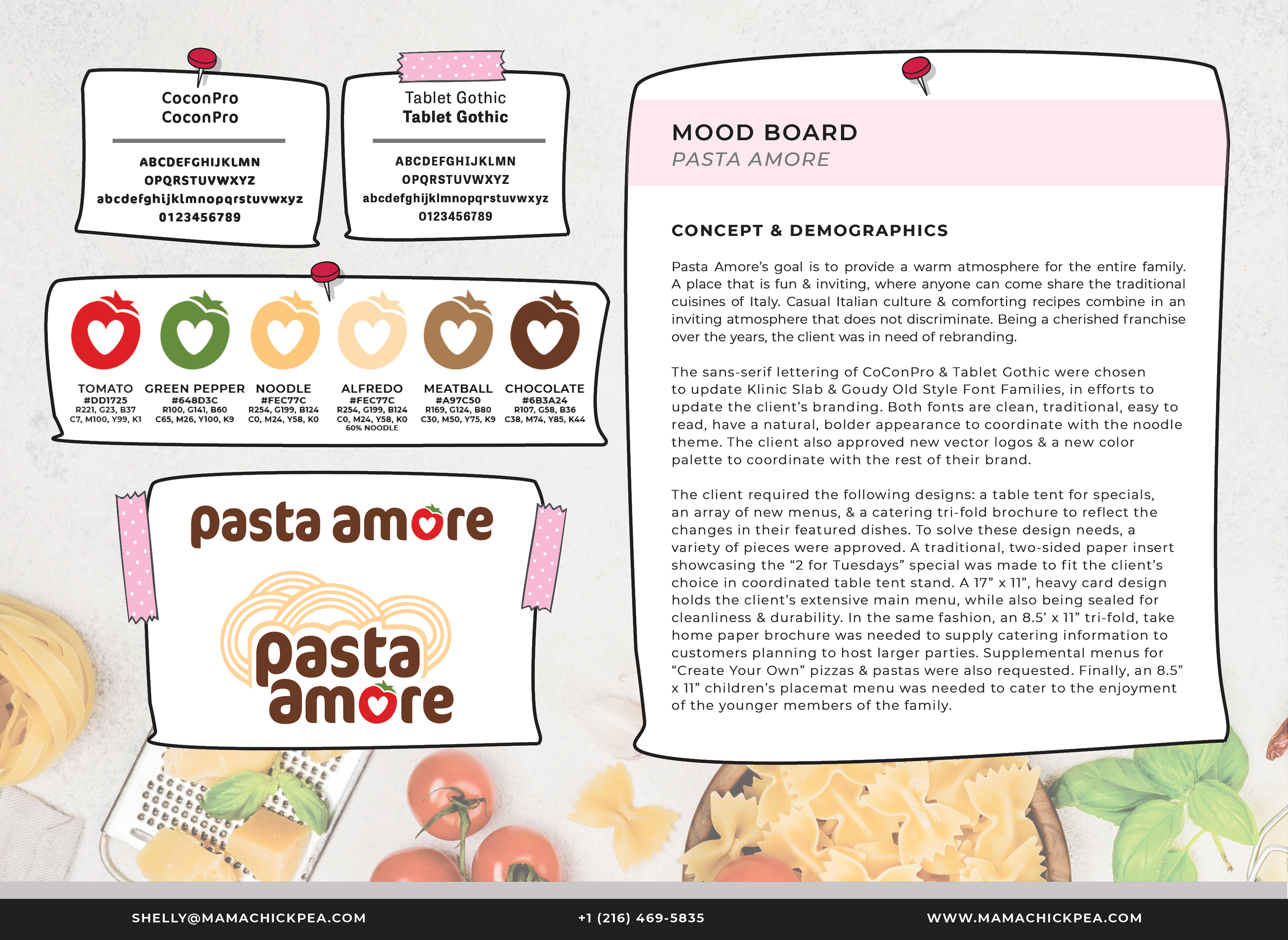
Since the project started with new branding & a logo, color selection was predetermined and included the colors of the Italian flag and various different flour pastas, browns to creamy yellow (colors that tend to make people hungry.) These hues were chosen in warm families, as the atmosphere of Pasta Amore is warm & inviting. The upcoming print materials also centered around these colors & concept, which followed through into other marketing materials.
SPECIFICATIONS
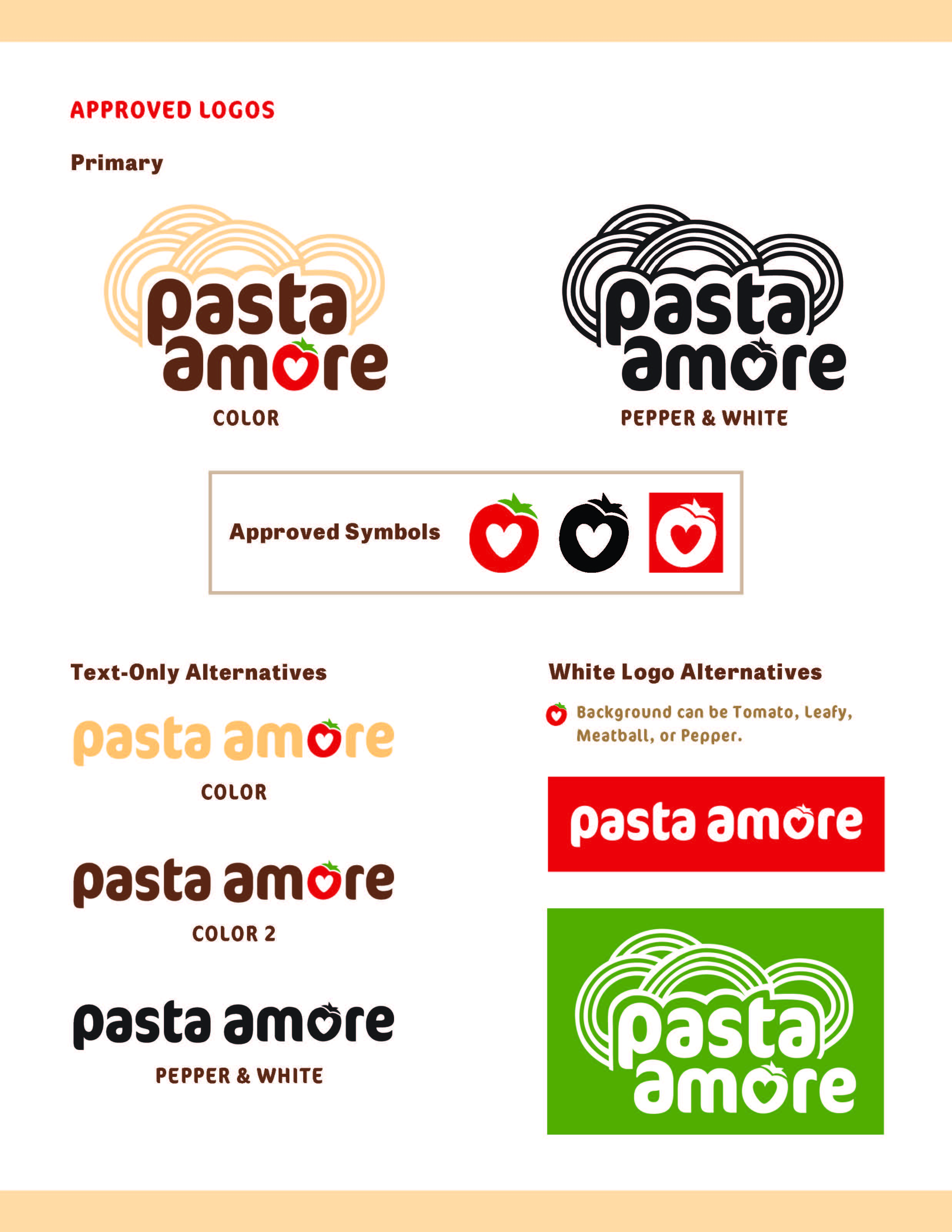
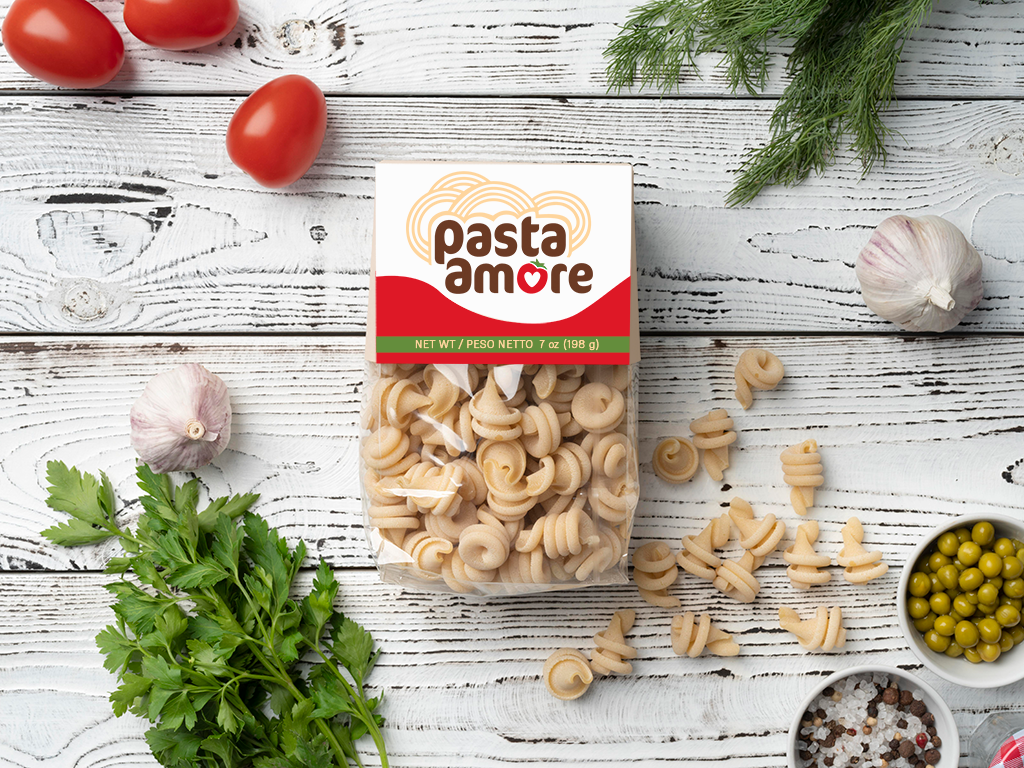
The logo for this project was created to feature fun pasta noodles, with the heart of all Italian cooking, the tomato. The color family was selected to coordinate with HEX values #211E1E, #4C2110, #825534, #F5BA79, #EA2427, & #762130. The font family Poppins was chosen for its cleanliness & ability to feature several weights for emphasizing. The client specifically requested a feel in line with these HEX values and the font family, as were previously defined with the creation of the new branding & logo. An image library was created via photoshoots in the locations, as well as stock photography chosen for its brand-defining character. Mock-ups were created as necessary for the store items.
RESULTS
Pasta Amore Brand Style Guide
