FOOD PACKAGING
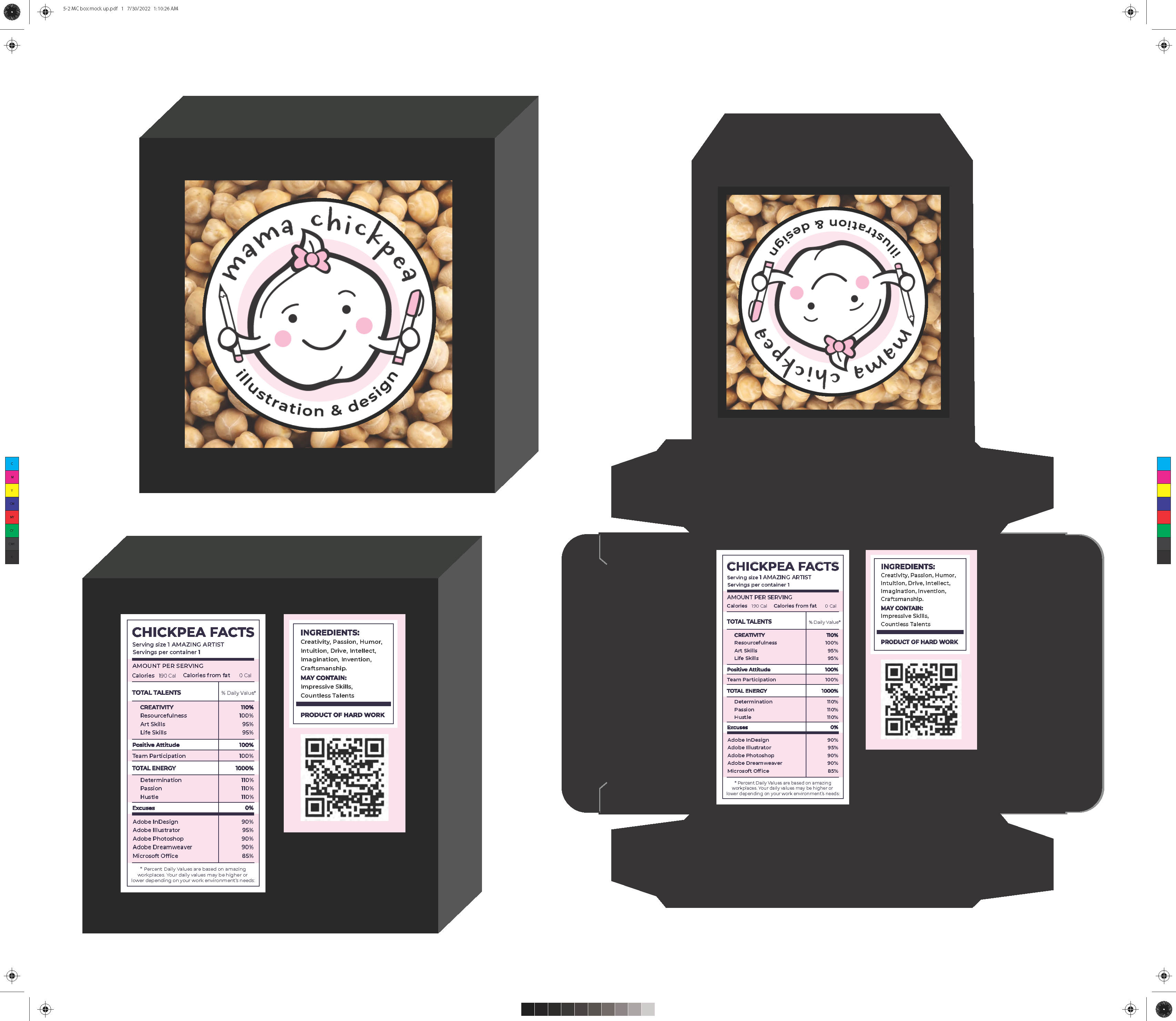
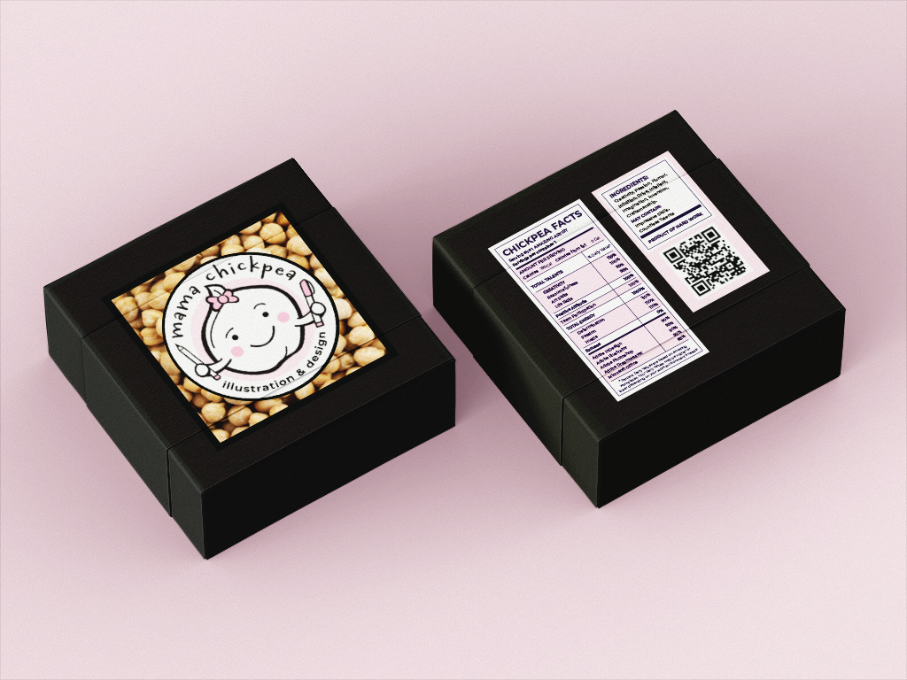
To coordinate with the brand imaging, a leave-behind piece was created for the Mama Chickpea brand. This piece functions as both a business card, as well as a clever branded item to distribute to "hungry" fans.
PROJECT INFORMATION
- SKILLS: Adobe Illustrator, Adobe InDesign, Adobe Photoshop
- FOCUS: Product Design, Branding, Illustration
- CLIENT: GRA420 Advanced Digital Imaging
- CONTACT: Professor Erica Lorenz-Hays
- PROJECT DATE: 2022
- PROJECT URL: N/A
BACKGROUND
CLEVER THEME-BASED PERSONA
Mama Chickpea started freelancing as a "mama" in 2014. Her nickname, "Chickpea," dated back to the art show circuits she displayed in, in the early 2000s, prior to the start of her studio, Miss Chickpea's Funky Fibers.
Always playing on the clever name of the chickpea, via its fibrous properties, artist Shelly as Miss Chickpea created a "Mini Pea" character, to help make people laugh & enjoy the brand, which featured art & classes for various fiber arts (knitting, crochet, felting, & weaving.) Clever displays throughout the line have always centered around combining the fiber arts with the food fiber of chickpeas. After the studio had to close in 2010, Miss Chickpea was reborn as Mama Chickpea, to also highlight the various creative hilarity of motherhood.
PARAMETERS
PROBLEM:
Mama Chickpea desired a clever leave-behind item that was original to the brand's identity.
TARGET AUDIENCE:
She wanted to attract a broad audience of men & women, roughly ages 18-65, who might desire her freelancing design services. Her clientele often has a sense of humor & this unique product would help keep the brand memorable.
CONSTRAINTS:
Turn around time for project was roughly two weeks, with imagery being catered to the product creation & to highlight the brand.
TASKS:
Initial audience & content analysis, logo (Adobe Illustrator), & mock-ups made in Adobe Illustrator. Final display imagery was created in Adobe Photoshop.
DESIGN RATIONALE:
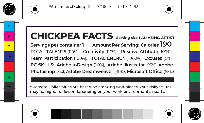
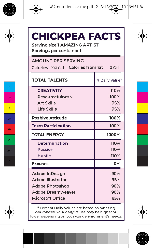
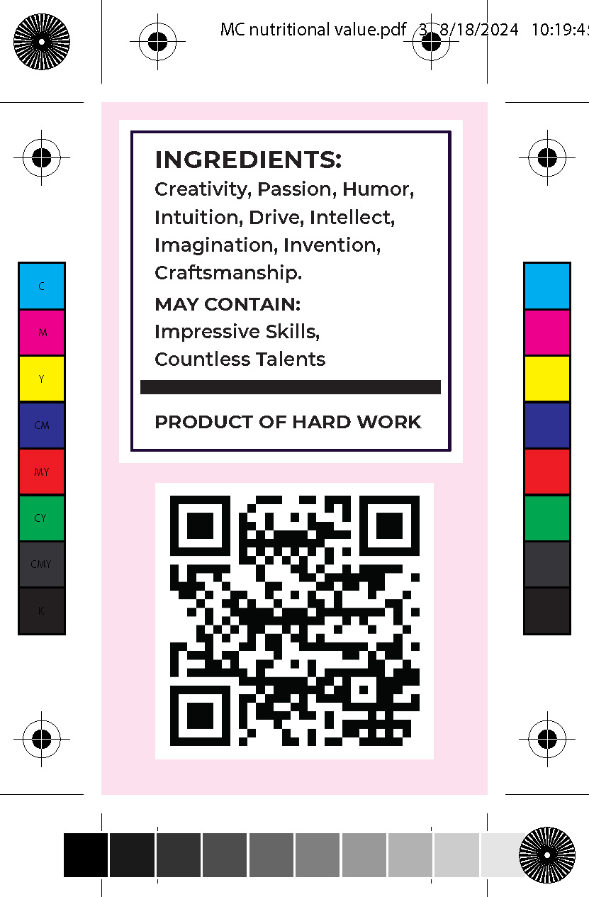
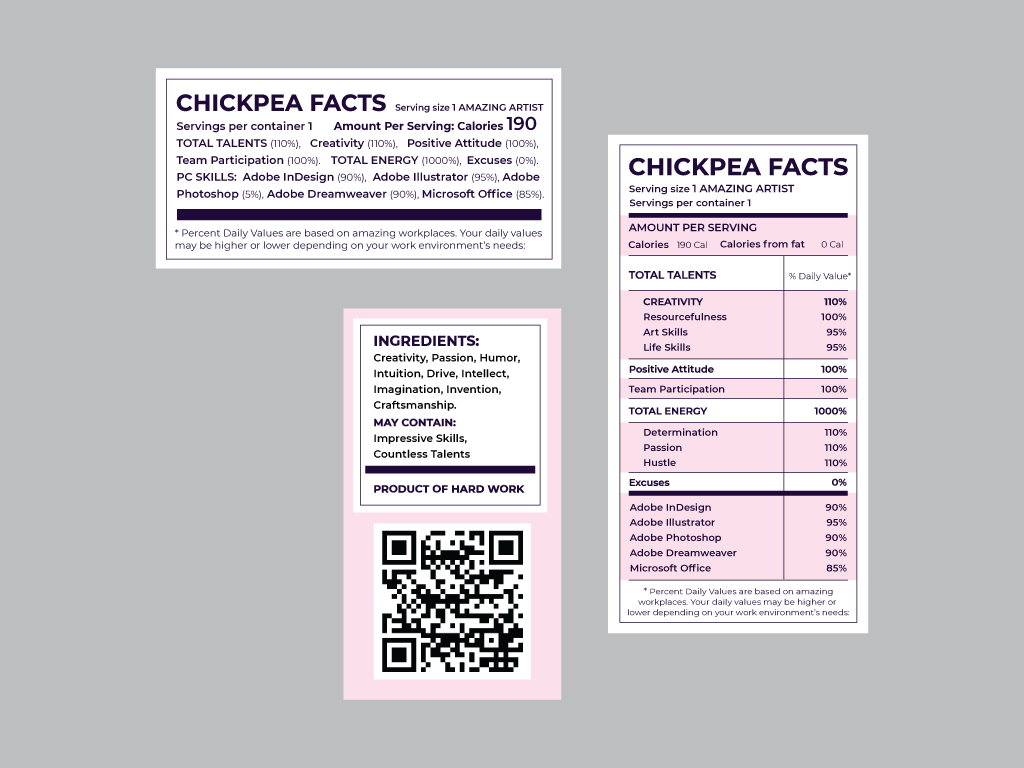
Packaging flavor dried chickpeas as a snack, this product design was intended to feature real aspects of food packaging, while also displaying key contact information for the brand. The brand likes to play on humor, so the concept helps create fanfare by being very original.
SPECIFICATIONS
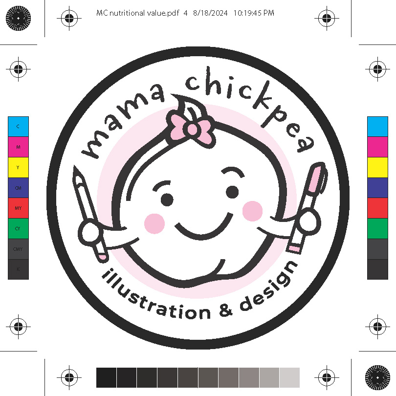
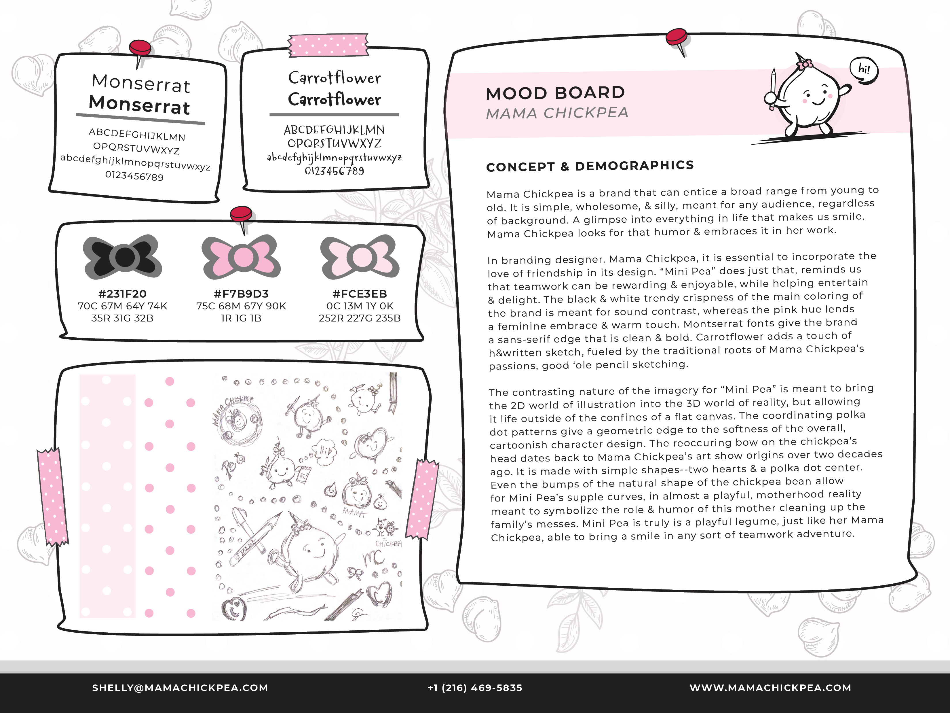
The logo for this project was previously created by the client. Color family was selected to coordinate with HEX values #231F20, #F7B9D3, & #FCE3EB. The font family Monserrat was chosen for its cleanliness & ability to feature several weights for emphasizing, while the font Carrotflower was chosen to mimic handwriting. An image library was created via stock photography chosen for its brand-defining character. Mock-ups were created as necessary for the product items.
RESULTS
Mama Chickpea Packaging
