LIBRARY TAXONOMY EVALUATION
BACKGROUND
The CITY PUBLIC LIBRARY has requested a redesign for their existing website. The design should be modern & emphasize easy-to-access information for all users through its cleaner design.
The goal of this project is to formulate answers to the following main questions:
- • Who are the target users for the CITY PUBLIC LIBRARY site?
- • What do these users need the website to accomplish past the current, basic design, & how can they easily find what they need?
- • How can these goals be accomplished by the redesign of the website’s IA?
PARAMETERS
SKILLS:
Adobe Illustrator, Optimal Treejack, Chalkmark, Microsoft Word, User Research, Information Architecture
FOCUS
Information Architecture, User Research, Testing, UX / UI, Web Design
CLIENT:
School Assignment, Professor Joe Manganelli
PROJECT DATE:
2023
PROJECT URL:
PROBLEM:
Evaluate library site content & organization & suggest ways to improve the site based off of research. The existing library site was very cluttered & it was difficult to find what users needed without frustration or guidance.
TARGET AUDIENCE:
Offering a handicap-accessible property, the audience includes the additional group of those patrons requiring handicap features, as well as the average booking patron, 18+ years of age and older.
CONSTRAINTS:
Turn around time for project was six weeks.
MY ROLE:
Initial site evaluation, user research, taxonomy study, testing, persona creation, wireframes
DESIGN RATIONALE:
After reviewing the existing site & testing with the stakeholders, several changes were recommended for fine-tuning the HTML / CSS for the design (focusing on the principles of universal layout & organization.) Wherever possible, these changes were suggested per WCAG accessibility standards.
KEY TAKEAWAYS:
Evaluating a website for user-centric design allows for a better understanding of an audience's user. In the case of this study, it would have been optimal to be able to actually intereact with the assignment's library patrons for more accurate testing of needs. While the user testing data definitely helps correct user issues with the site, these issues could have been fine tuned better with the actual residents of the town.
This study allowed for experience with Chalkmark through Optimal Studio, which allowed for testing of suggested wireframe improvements. These tests were very interesting to read & the data helped correct site issues. I really liked use of this application for user testing. Having created digital, mid-fidelity wireframes prior to the testing study greatly helped users in these tests.
RECOMMENDATIONS
PROJECT PLAN
Deliverables on this project to include: define the user & their needs (through user research & testing), assess labeling & taxonomy, iteration of designs (new navigation & organization schemes).
PRIMARY RESEARCH PROTOCOL
To understand the CITY PUBLIC LIBRARY user’s needs better, to redesign an optimal IA infrastructure site around those needs.
- 1. Selected two (2) key participants & conducted research to discover any needs for the redesign of CITY PUBLIC LIBRARY’s website. (Signed consents were obtained from the 10 minute sessions & notes were recorded.)
- 2. Literature research was conducted for archival resources to address the needs of the user.
- 3. Assemblage of updated user task list was produced from data collected.
- 4. User persona(s) were developed from the research & the research brief comprised.
- 5. The full PARTICIPANT PROTOCOL, including the following INTERVIEW SCRIPT, was followed for these interviews.
INTERVIEW SCRIPT
Unstructured interviews were conducted with two librarians, using the following script:
- 1. What is your occupation & for how long have you worked here?
- 2. Have you worked at other libraries before?
- 3. Do you interact with library patrons?
- 4. Do you help patrons with using the library website?
- 5. Why did you visit the library website today?
- 6. Have you ever personally used the website before & if you have, for what?
- 7. What information at a library do you use most often? How often do you go?
- 8. What do you see patrons mostly use a library site for? Does your library website function better?
- 9. Are the patrons able to find what they are looking for on the Sharon Public Library site? What causes the most trouble?
- 10. Where does the library website fail these tasks the patrons need?
- 11. Is there any information, feature, or improvement you would like to see with the Sharon Public Library site to further aid the library in doing its job?
INTERVIEW FINDINGS
Three main categories emerged from the results of the unstructured interviews:
- Who are the target users for the CITY PUBLIC LIBRARY site? Adults (all ages 18+), students (all ages), seniors, disabled patrons (all ages), & families.
- What do these users need the website to accomplish past the current, basic design, & how can they easily find what they need? The design needs to be modernized, streamlined, & have better accessibility for all users. There needs to be a site search function, not just a catalog search. The events links need to be more inviting with images & other forms of linked content than just plain text, with better organization.
- How can these goals be accomplished by the redesign of the website’s IA? Reducing hyperlinks / plain text abundance. Organize the events to make them user-friendly & attractive. Simplify searching & adjust navigational labeling as needed. Reduce primary navigation & adjust footer to fat footer sitemap
SECONDARY RESEARCH USING LITERATURE
Library research was conducted using scholarly sources on ideal practices for library websites. This can be found in the official stakeholder brief.
RESEARCH GOALS
- 1. REDUCE ANXIETY: Streamlining navigational menus & reorganizing the main content in an easier-to-use design will reduce user anxiety. Anxiety leads to reduced website usage or frustrated patrons needing more help from library staff. Utilizing interviews or analytics to move lesser needed navigational links to a newly redesigned fat footer may help lessen this initial page overload.
- 2. SITE SEARCH: Utilizing a newly designed catalog search to resemble the design of the CITY PUBLIC LIBRARY site more closely may lessen patron confusion. The addition of a site, second search feature, to solely search the CITY PUBLIC LIBRARY website, would also help patrons find what they need easier. Keeping a clean, organized & uniform list of needed traits (title, URL, a description, access information, date, help / research guides, the type of resource / format it is in, the publisher, any related subjects, & the frequency of its publication) to locate these items is key to organizing these effectively.
- 3. THEMATIC EFFECTS: Through request of the CITY PUBLIC LIBRARY & complimentary research findings, lessening the plain text loaded with blue hyperlinks by adding these links in other visual ways (like images) may help reduce the reading overload presented on each page, such as the “Events” navigational tab. These visuals help users scan the site quicker for what they need, while providing more enjoyment in doing so. These changes will also help address usability.
- 4. BREADCRUMBS & PAGE TITLING: Adding a uniform H1 header to each page, complete with breadcrumb navigation, will help keep users on task & in their proper position within the site. This would also allow them to retreat to previous pages more easily & address usability issues.
- 5. PAGE TABS: Reducing the number of new tabs opening for each move within the website navigation would also lessen user confusion & frustration. This element should be reserved for links that open different formats (such as a PDF form) or a link to an outside website (i.e., social media pages.)
TASKS
High priority tasks: addition of unified look to page structure & breadcrumb navigation, navigate the site links easier (with more modern approach), discontinue new window opening for each link within the site.
Medium Priority tasks: find site information via site search (in addition to Catalog Search feature), events to attend (organized better & easier to view.)
Low priority tasks: reserve a book easily, Catalog Search suggesting additional books (organized by interest), organize site forms better (forms to include: volunteer, class sign-up, room reservation.)
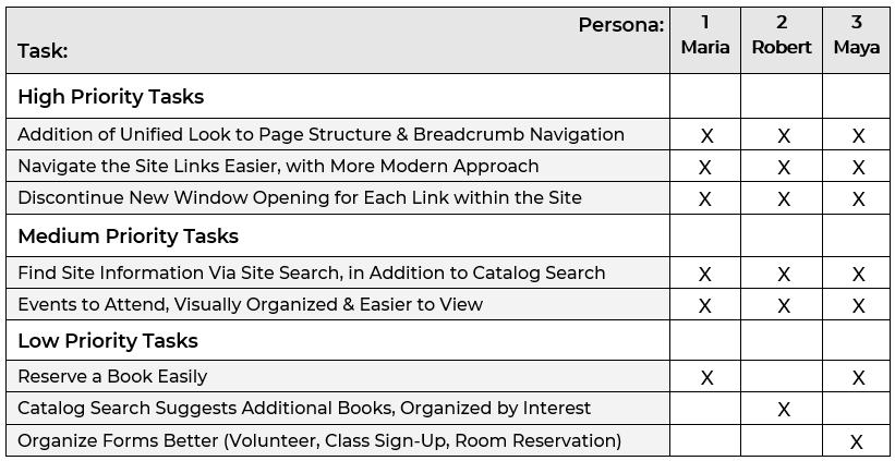
IMAGE: Tasks by severity, per personas.
PERSONAS
Three personas were created from the research conducted. Primary personas Maria & Robert, with secondary persona Maya. Motivational scenarios were also created for these personas. Details on these personas & their scenarios can be found in the UX Brief.
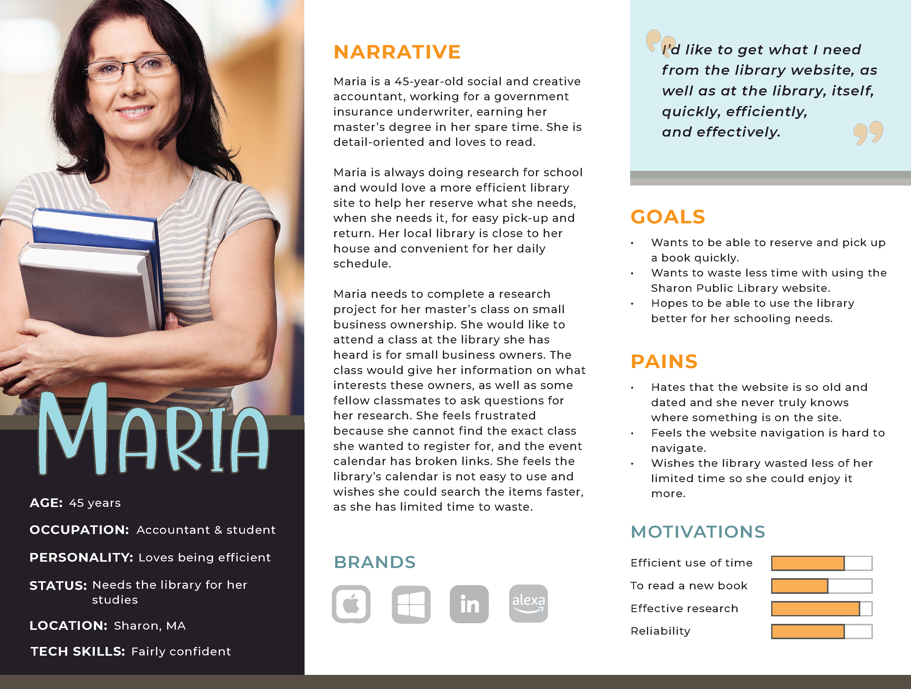
IMAGE: Primary persona Maria.
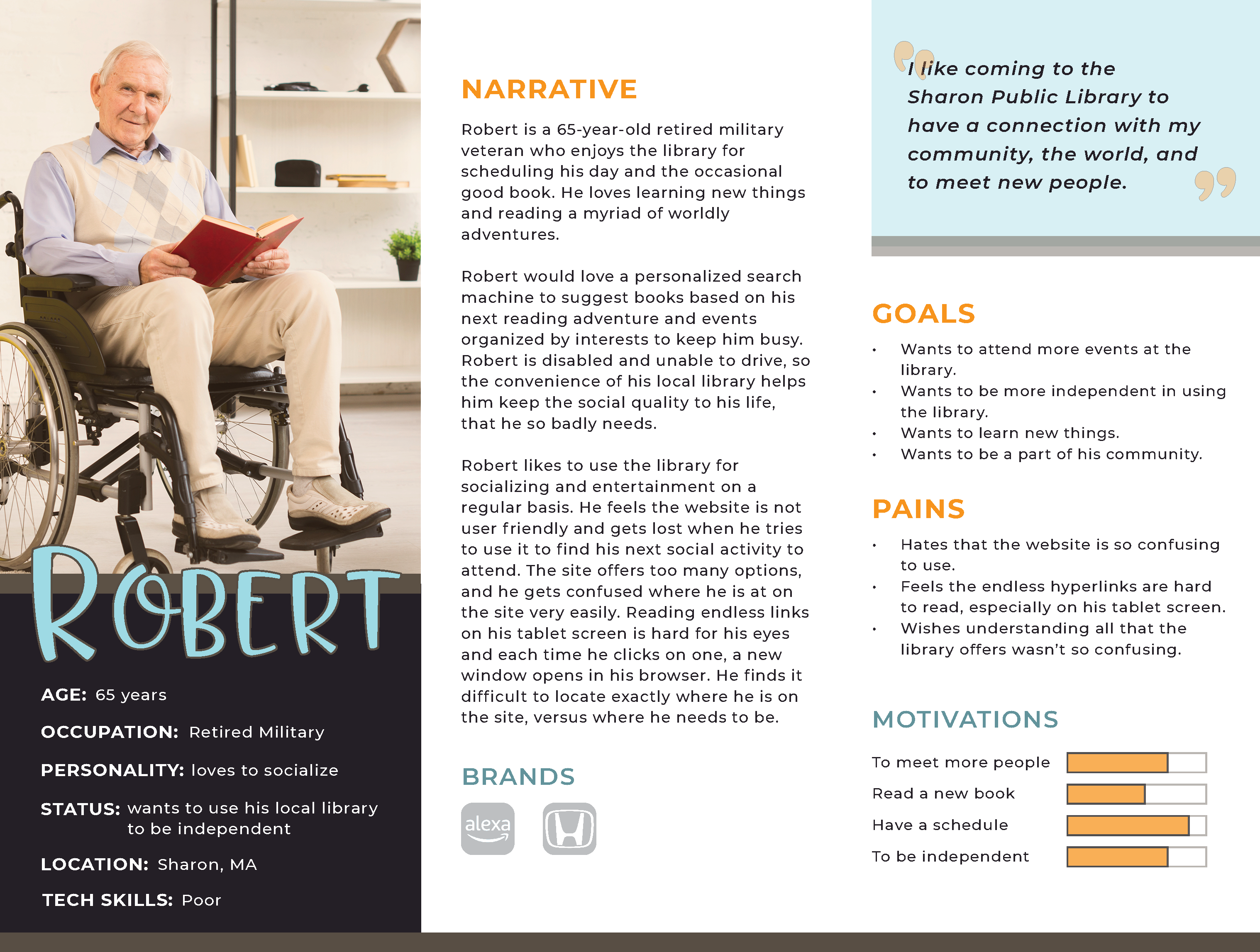
IMAGE: Primary persona Robert.
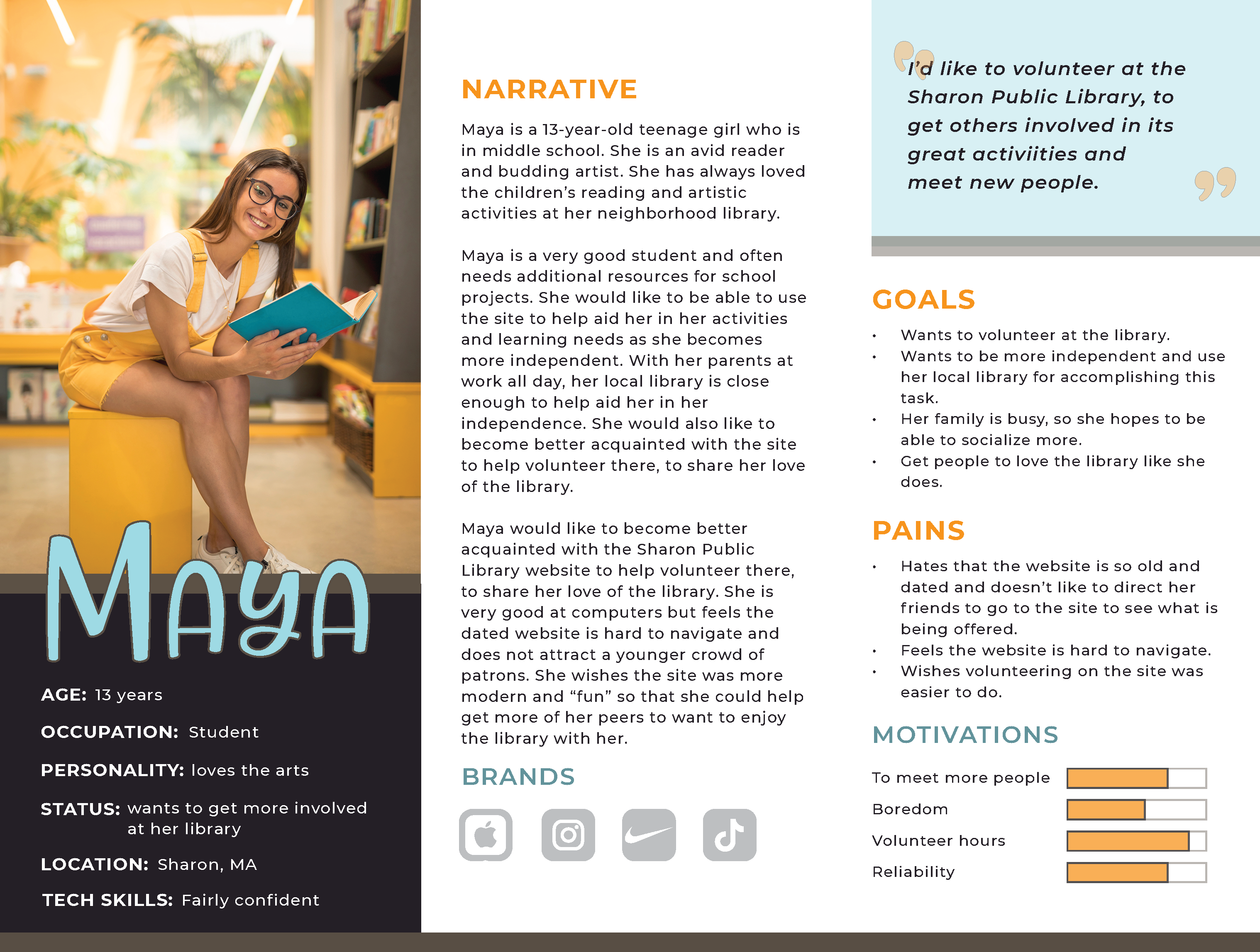
IMAGE: Secondary persona Maya.
CONTENT ANALYSIS
Content analysis for the existing taxonmy of the CITY PUBLIC LIBRARY site was performed in Microsoft Excel. Each navigational link was catalogued & characteristics such as the URL, type of link (internal, external, or offsite), any issues encountered, comments, & suggested future outcome for the link recorded (add, delete, archive, or change.) From this spreadsheet analysis, taxonomy issues were identified & addressed with Treejack & Chalkmark testing.
TESTING
In accordance with the personas & defined tasks, an initial sitemap was created. This provided a navigational tree to create initial wireframe sketches & test the taxonomy in Treejack & Chalkmark as promised in the original deliverables. A total of ten participants completed both rounds of testing.
TREEJACK
In accordance with the personas & defined tasks, an initial sitemap was created. This provided a navigational tree to test the taxonomy in Treejack as promised in the original deliverables. A total of seven task questions were asked in the Treejack testing.
Eaxmple task question: Robert wants to find a new program to socialize. He is an active senior & wants to try something new. Where would he go to look at programs for adults? (Answer: Home → Events & Programs → Programs → Adult)
Overall, the participants completed tasks with about 83% accuracy, which is promising. The data shows that the new labeling & placement are more effective; however, they could use a bit more tweaking.
WHAT WORKED
- • 10 out of 10 participants successfully located eResources.
- • 9 out of 10 participants successfully located Programs for Adults.
- • 9 out of 10 participants successfully located Volunteer Services.
WHAT NEEDS IMPROVEMENT
- • 8 out of 10 participants located the Town of Sharon’s Local History.
- • 8 out of 10 participants located Special Collections for Veterans.
- • 7 out of 10 participants located New Library FAQ.
- • 7 out of 10 participants located the Request to Exhibit under Art Exhibits.
CHALKMARK
In accordance with the personas & defined tasks, an initial sitemap was created. This provided a navigational tree to create initial wireframe sketches & test the taxonomy in Chalkmark as promised in the original deliverables. Five scenario-based tasks & one additional task question were provided for participants to test the new site navigation & labeling, per the redesigned wireframes.
Overall, the participants completed tasks with about 92% accuracy, which is very promising. The data shows that the proposed wireframes are effective; however, the Volunteer Services section still proved to be a trickier find. It is not crucial to all patrons though. Usage over time may be the best recommendation to find its most convenient final location. A direct link to it on the new fat footer, as well as adding a site-wide search may fix this. Detailed Chalkmark results available in Full Testing Report PDF.
WHAT WORKED
- • 10 out of 10 participants successfully located Literary Resources.
- • 10 out of 10 participants successfully located the link to change the month view for the Events calendar.
- • 9 out of 10 participants successfully located the form link for Volunteering.
- • 9 out of 10 participants successfully located eResources by Topic section on eResources.
- • 9 out of 10 participants successfully answered the additional task question to locate eResources by Source.
WHAT NEEDS IMPROVEMENT
- • 8 out of 10 participants located the Volunteer from the Homepage.
WIREFRAME REVISIONS FROM CHALKMARK TESTING
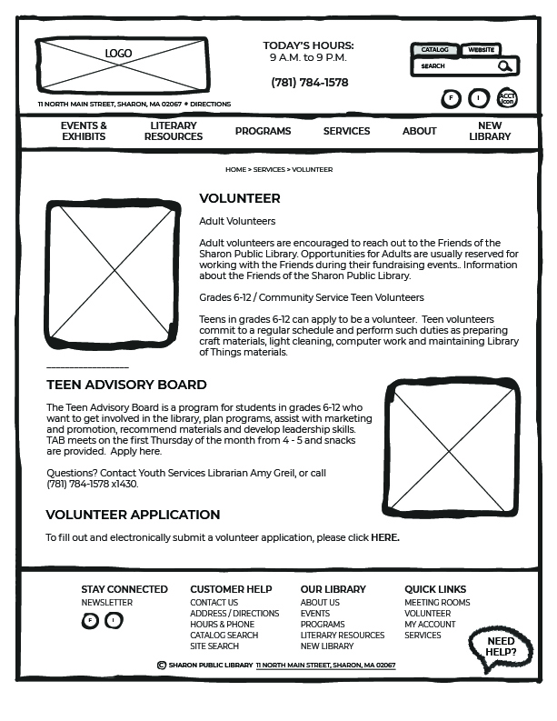
When creating the Volunteer Services page, attention to the FORM area for applying needs to be more straightforward. Suggestion is to include the form embedded directly on that child page, instead of having users locate a new page via a link.
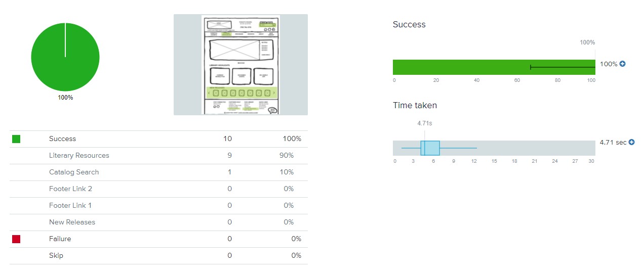
IMAGE: Sample report image from Chalkmark Testing for Task 1, which had a success rate of 100% in an average of 5.4 seconds.
RESULTS
The full CITY LIBRARY REPORT PDF can be viewed by clicking the link below. Key final recommendations for taxonomy & adjusted wireframes are seen below this link. Annotations are provided as needed.
WIREFRAME & WORKFLOW RECOMMENDATIONS
Keeping these schemes in mind, along with the budget & schedule for the proposed project, the following high priority tasks were addressed in key workflows in order to suit the needs of the CITY PUBLIC LIBRARY. Some other tasks were semi-addressed due to time limitations but introduced in the overall aesthetics of the new redesign. These ideas could be further explored as new project timelines, as needed.
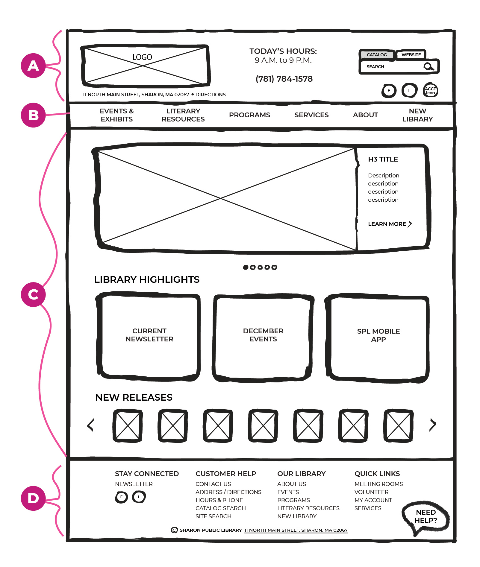
IMAGE: Sections of the new Homepage.
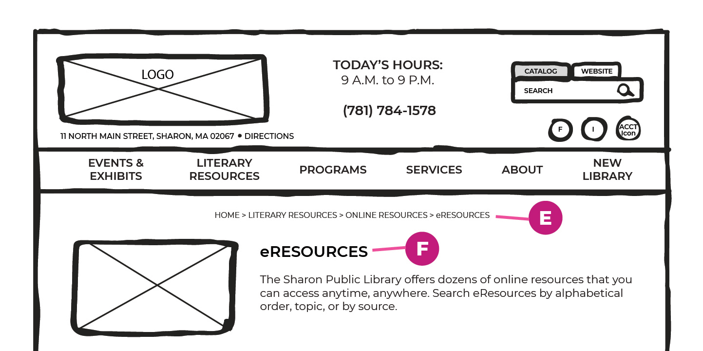
IMAGE: Detail of the new Breadcrumb & Uniform Page Styling.
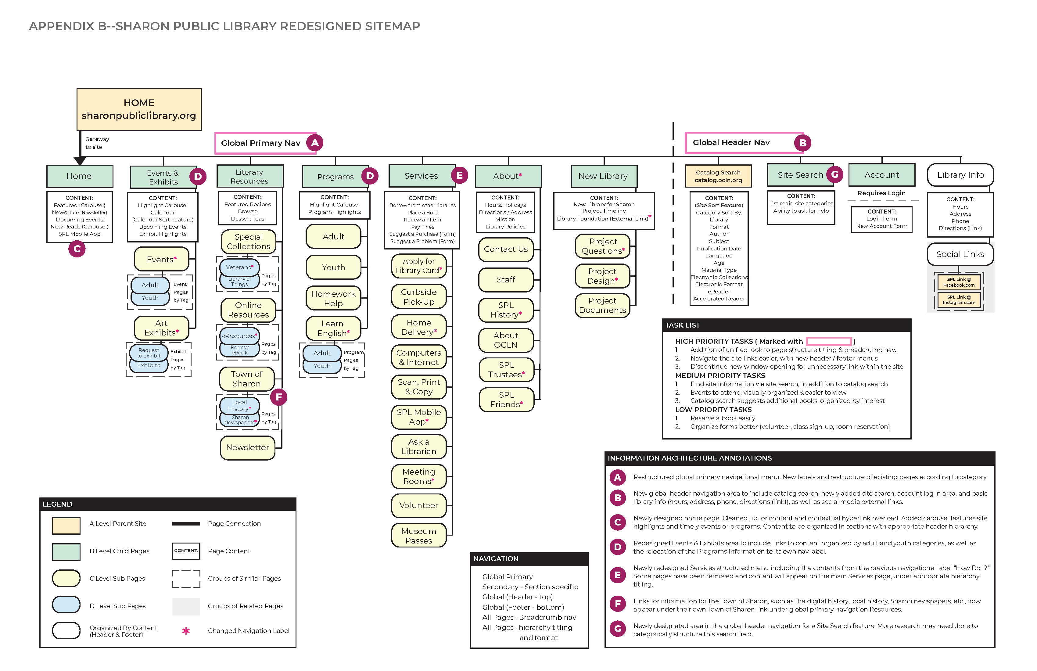
The core tasks for these wireframes included streamlining global navigation (header A & footer D) & addressing the addition of uniform page titling/structure F & breadcrumb navigation E to each page within the site. Streamlining navigation included addressing navigational labels B and the organization of the sub menu content underneath those labels. Coding recommendations to address the lessening of the creation of a new tab in a predictable & more uniform manner were recommended to the client, as the opening of random new windows causes the user to lose their point-of-reference in the organizational structure & leads to even more anxiety.
The refined top level navigational labels B seen throughout the new wireframes are as follows:
- • Home
- • Events & Exhibits
- • Programs
- • Services
- • Resources
- • About
- • New Library
In addition to these labels, the recommendations for the new global header navigation A included the hours, address, phone, & direction link, as well as the social media icon links from the old footer menu. These items were chosen through the project research as being helpful to the library user. This menu also houses an account icon link & a search field for both the catalog (existing), as well as the site (new & due to time-constraints solely a wireframe suggestion.)
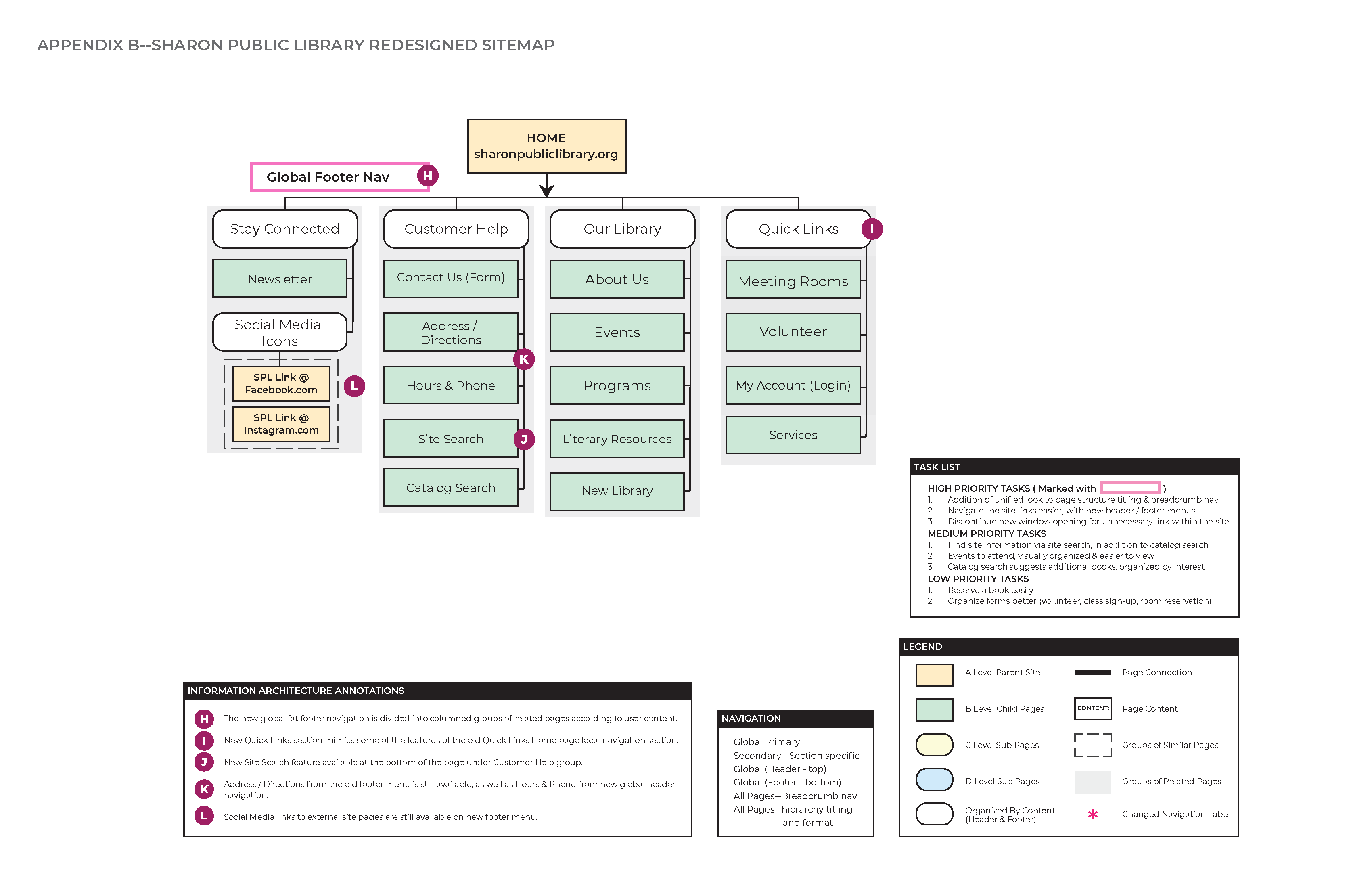
The newly redesigned fat footer navigation D allows for some additional key links off the global primary navigation, organized by topical columns, as well as restates some key holdings from the new global header navigation. This fat footer helps reduce the redundant page content eliminated on the homepage under the local navigational Quick Links & removes the redundant How Do I? global navigational header link, as it can be an ambiguous label & repeats pages in a key area currently adding confusion.
Redesigning the homepage contextual content C to highlight the site’s current events, newsletter, new releases, new mobile app, & a rotating hero banner carousel allow for the user to be more entertained in a modern website feel. This new content reduces reading endless plain text & removes the noise of endless hypertext links, thus reducing user anxiety & improves upon the whitespace of the page.
These new features helped to produce key wireframes & workflows for three key tasks, as determined by the personas. These wireframes & workflows were tested via Chalkmark, as promised for module 5 deliverables.
The following wireframe illustrates the new global navigation in both the header & the fat footer, as detailed in the final sitemap. It also helps illustrate some of the new stylistic UI structure concepts for the content on the site’s child pages, including hero carousels, image highlight links, & scrollable items.
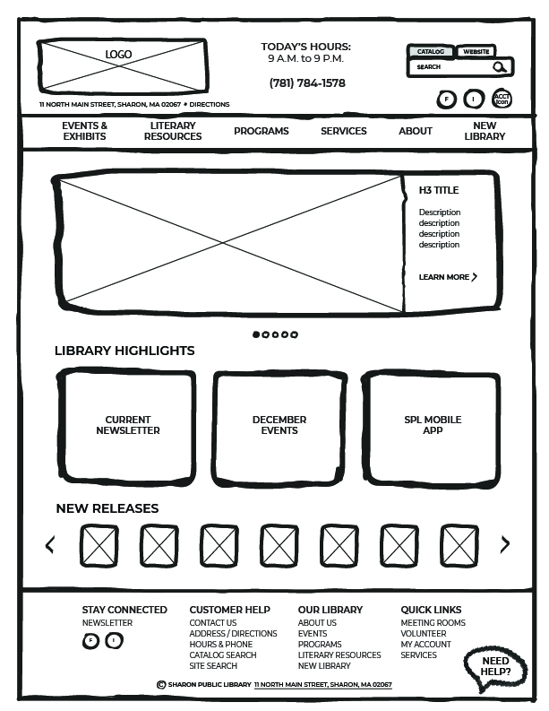
IMAGE: Newly redesigned homepage wireframe.
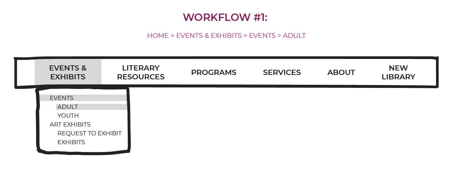
IMAGE: Workflow 1 to get to Adult Events for Robert.
Workflow 1 follows the breadcrumb navigational pattern: "Home → Events & Exhibits → Events → Adult"
The landing page for Adult Events was designed to help persona Robert find events to attend for his mature age & social level, in a more direct & simplified manner. Clicking on the global primary menu link Events & Exhibits allows for a dropdown menu to give Robert further selections all in one place.
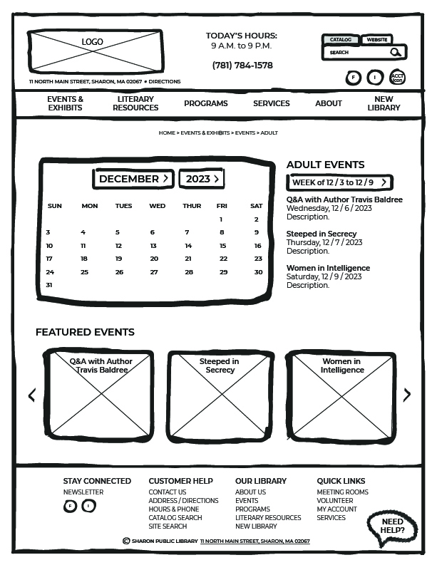
IMAGE: "Home → Events & Exhibits → Events → Adult" child page.
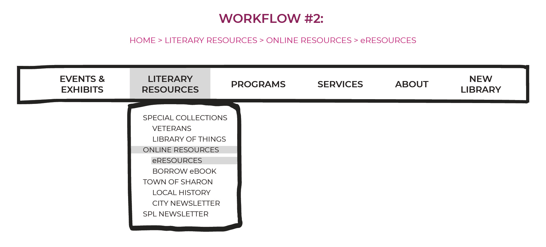
IMAGE: Workflow 2 to get to eResources for Maria.
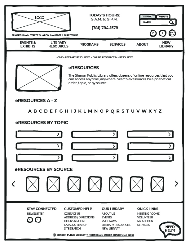
IMAGE: "Home → Literary Resources → Online Resources → eResources" child page.
Workflow 2 follows the breadcrumb navigational pattern: Home → Literary Resources → Online Resources → eResources.
The landing page for eResources was designed to help persona Maria find online resources for her school research projects, in a convenient & simplified manner. Clicking on the global primary menu link Literary Resources allows for a dropdown menu to give Maria further selections all in one place. The eResources page utilizes schemes from the original site in a more stylized way
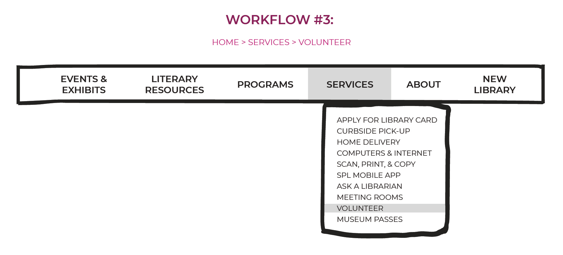
IMAGE: Workflow 3 to get to Volunteer Services for Maya.
Workflow 3 follows the breadcrumb navigational pattern: Home → Services → Volunteer.
The landing page for Volunteer services was designed to help persona Maya find more information about volunteering at the library. Clicking on the global primary menu link Services allows for a dropdown menu to give Maya further selections all in one place, including the application form to fill out & submit.
