USER RESEARCH HOTEL EVALUATION
BACKGROUND
The Hotel brand hopes to increase their customer loyalty & overall brand reliance as a top hotel destination for business & leisure travelers. This report presents the results of qualitative user research through in-person & remote interview sessions in hopes of improving functionality for their clientele & loyalty through return patronage.
The goal of this user research project is to formulate answers to the following main topics:
- • Helped define strategies for understanding important user preferences & behaviors that support strategic business objectives.
- • Gained insight to help the company increase booking reservations.
- • Gained insight into how to increase their loyalty program participation.
PARAMETERS
SKILLS:
Adobe Illustrator, Microsoft Word, User Research, Participant Interviews, Data Analyzation, Presentation Reporting
FOCUS
Participant Interviews, User Research, Reporting, UX / UI, Web Design
CLIENT:
User Research II class assignment, Professor Joe Manganelli
PROJECT DATE:
2024
PROJECT URL:
HOTEL USER RESEARCH PRESENTATION LINK
PROBLEM:
Evaluate hotel patrons' needs for a stay & ways to get them involved in the brand loyalty program. Website task evaluation to see why bounce rates are higher than desired & how to help improve upon completed bookings through loyalty members.
TARGET AUDIENCE:
The average booking patron, 18+ years of age and older, can come from any demographic.
CONSTRAINTS:
Turn around time for project was six weeks.
MY ROLE:
Initial booking & loyalty program needs evaluation, user research, interviews, persona creation, report recommendations for adjustments
DESIGN RATIONALE:
After reviewing the existing site & testing with nine participants in two rounds of testing, several changes were recommended for fine-tuning the HTML / CSS for the Hotel website (focusing on the principles of universal layout & organization.) Wherever possible, these changes were suggested per WCAG accessibility standards. A list of booking requests was assembled & data for both hotel amenities as well as loyalty program features was established.
KEY TAKEAWAYS:
Evaluating a website for user-centric design allows for a better understanding of an audience's user. In the case of this Hotel brand study, it was difficlut to find actual patrons of the brand for a more accurate testing of needs. Participant interviews definitely uncovered chief characteristics in needed amenities, as well as how people felt looking at the loyalty program on the website. It was unclear how exactly to improve upon loyalty program patronage; however, most participants listed why they like programs they regularly belong to & why they use them.
As the moderator for the interviews, I feel I fine tuned some interviewing skills through practice. Being able to work from the script, but also able to adjust as needed, is definitely a skill that comes from practice. For the most part, most participants like to talk experiences & why they feel the way they do. The skill definitely develops somewhere in between letting them talk it through, but not get too off topic. Closed end questions provide a means to get some quantitative data for statistical comparison through scripted interview sessions.
RECOMMENDATIONS
PROJECT PLAN
Deliverables on this project to include: define the user & their needs (through user research & testing), assess labeling & taxonomy, iteration of designs (new navigation & organization schemes).
RESEARCH THEMES
Three high-level research themes were derived per the Project Overview, as described above. The following seven concept ideas helped formulate these themes.
- 1. How do people book a stay at Marriott.com? Are there common user workflows or preferences? Do users encounter broken or confusing links / options?
- 2. What issues or pain points do people experience when booking their room on Marriott.com?
- 3. What are the most sought out amenities when people book using Marriott.com? Do users find everything they need to effectively book a room?
- 4. Do users abandon the booking to check other sites prior to completing the booking? If so, why? And what would make them return?
- 5. How do people use the loyalty program on Marriott.com? Do they know how to earn / redeem points on the website, or can they find how to learn more about its characteristics?
- 6. Is user navigation effective for the loyalty program? Are there common user workflows or preferences? Do users encounter broken or confusing links / options?
- 7. Can users find ways to get help on the website, if needed? Did users get confused or appear to need help from issues involving the website’s organizational architecture?
Research Theme 1 explored the stakeholder goal to understand the user engagement with the loyalty program.
Research Theme 2 helped stakeholders understand user engagement with booking a room.
Research Theme 3 helped reveal ways to make website navigation more user friendly to both book a room & use the loyalty program.
INTERVIEW SCRIPT
Unstructured interviews were conducted in two rounds, using the following script highlights:
- ● Icebreakers, such as demographic information.
- ● Multiple choice: How many times a year do you BOOK a hotel? How many times a year do you STAY in a hotel?
- ● Are you a Hotel brand user? If not, what do you use?
- ● Are you a Hotel brand loyalty program user? If not, what do you use?
- RESEARCH THEME 1
- ● TASK: Can you find the loyalty program information on the website? Can you show me?
- ● TASK: Can you find how to view the benefits with the loyalty program? Can you show me?
- ● Which feature do you consider more important: earning points quickly or redeeming points easily?
- ● Which benefit do you consider more important: free room upgrade or complimentary breakfast?
- ● If you personally enrolled in this loyalty program, which reason would attract you more: to accumulate points for free stays or to receive member-exclusive discounts?
- ● Do you feel as though you are a more valued hotel customer if you are a member of a hotel loyalty program, yes or no?
- ● TASK: Do you know how to find help on the website for the loyalty program, if needed? Can you show me?
- ● Did you find the loyalty program straightforward or confusing? If so, what stood out either way?
- ● Can you suggest any feature you think might be missing for this program?
- ● Would you refer a friend to sign-up, given the features & ease of being a member? Would your feelings change if there was a way to be compensated for it, via free stays or discounts?
- ● If you are a member of other programs, particularly for travel systems such as hotels, what features do you regularly use? Did you see these features in the Bonvoy program information?
- RESEARCH THEME 2
- ● TASK: Can you locate how to book a room on the website? Can you show me?
- ● When booking a hotel room, would you rather use the hotel website directly, or a third-party website for hotel booking?
- ■ OPTIONAL: If you regularly use another site for booking hotels, which site? Why do you prefer that booking site over what you see on the website?
- ● When selecting a hotel room, which is more important to you: price or location?
- ● What type of offer would encourage you to book a stay: a discounted room rate or a specific free amenity, such as free breakfast?
- ● Can you list your top five ROOM features, when booking a stay?
- ■ OPTIONAL: Does this list vary depending on the needs of your stay, such as for business or leisure, or when traveling alone or with your family? If so, how & why?
- ● When booking a room, would you be more likely to go to the hotel website on a PC, or book directly through a hotel app on your phone?
- ● TASK: What do you think of the Search feature for booking? Can you play with it & think aloud?
- ● Did it seem easy-to-use? Did you see the options you thought were necessary?
- ● TASK: Do you know how to find help with booking questions, if needed? Can you show me?
- ● Can you list your top five features for a hotel BRAND? (This means values for the grounds & quality of the stay, such as customer service, safety, cleanliness, etc.?)
- ● Can you walk me through a time where you searched for & compared different hotels for a trip?
- ● How long does it usually take for you to make a hotel decision, when booking a room? What information do you find most useful? (i.e., photos, descriptions, reviews?) Did you find this information on the website?
- ● Do you have faith in hotel booking sites, particularly, do you think the booking feature is trustworthy on the website?
- ● If prompted with a “return to complete your stay” follow-up email or promotional offer, how likely would you be to return to the booking & complete it?
- RESEARCH THEME 3
- Let’s start with a “5 second rule” perspective for the website homepage.
- ● Do you feel like you understand the information being presented to you without scrolling anywhere?
- ● Does anything feel confusing for this section, particularly about how to book a room?
- ● Did the large hero image (and offer being presented) feel clear to you?
- These next questions are about your previous browsing in this interview & about the site.
- ● Did you identify how to find / log into the loyalty program on the website with ease? Could you book a room with ease?
- ● Were there any navigational links you encountered that were particularly helpful or confusing?
- ● What navigational features did you uncover that were / weren’t useful for you? Were there required fields that you felt were unnecessary, invasive, or frustrating?
- ● Did you uncover any broken links? Any errors?
- ● Did you encounter any website accessibility issues during your tasks?
- ● Could you read the information easily? Did the page size adjust as needed? Were the button labels easy to understand?
PARTICIPANTS
Full details can be found on all particpants in all PDF reports.
ROUND 1 PARTICIPANT HIGHLIGHTS
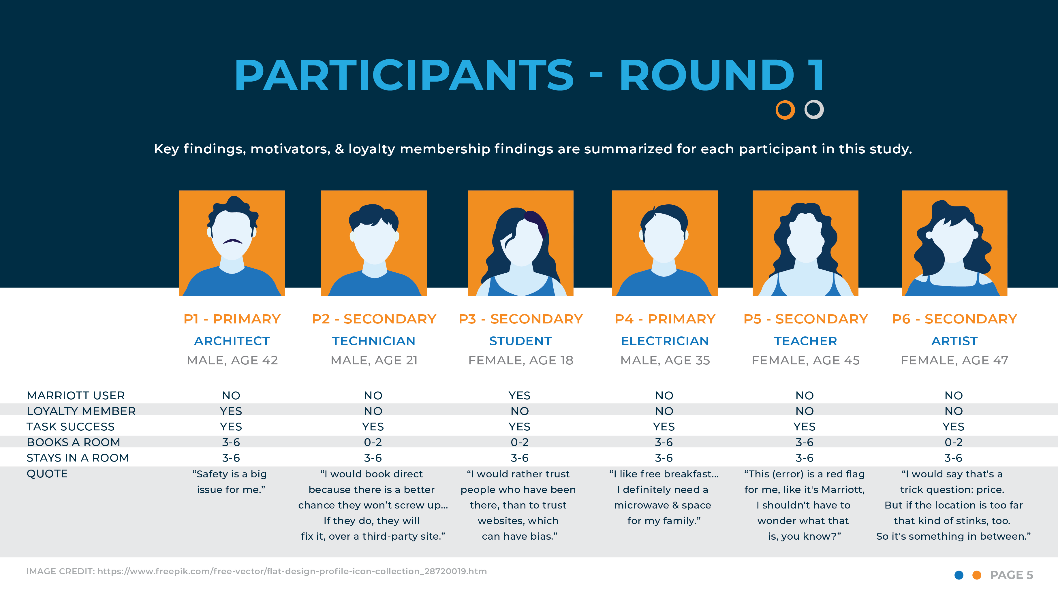
IMAGE: Participants - Round 1.
ROUND 2 PARTICIPANT HIGHLIGHTS
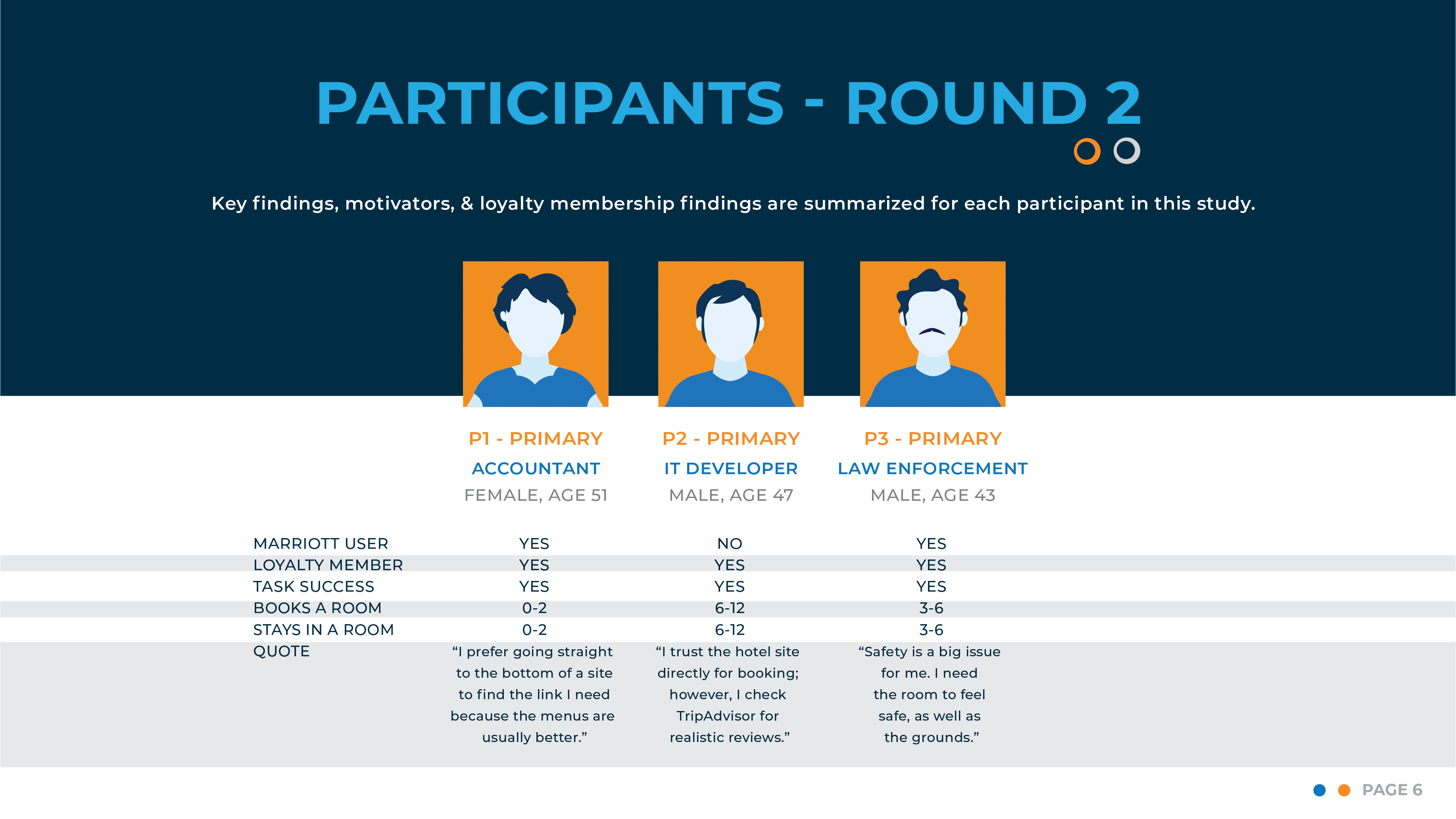
IMAGE: Participants - Round 2.
SYNTHESIS OF INTERVIEW RESULTS
RESEARCH THEME 1
TOP LOYALTY PROGRAM FEEDBACK, PER PARTICIPANTS:
- ● 4 participants were a member, but 0 use the program.
- ● 1 participant argued that “free room upgrade” doesn’t exist.
- ● “Free breakfast” was mentioned by all participants
- ● All participants found program straightforward.
- ● 1 participant disliked “Bonvoy” & found it confusing as logo.
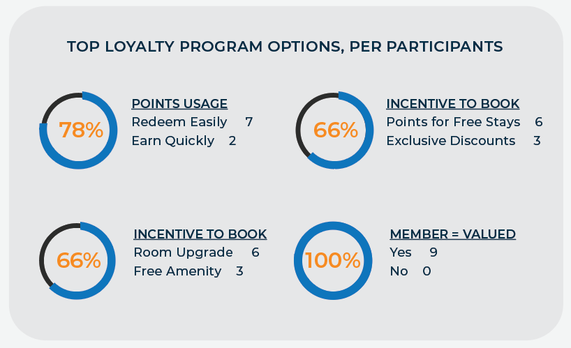
IMAGE: Closed question stats, loyalty program.
RESEARCH THEME 2
TOP BOOKING FEEDBACK, PER PARTICIPANTS:
- ● Participants preferred third-party booking sites (Kayak, Booking.com, Priceline).
- ● Reviews more trustworthy on third-party sites like TripAdvisor.
- ● 8 participants distrusted hotel sites viewing them biased.
- ● 1 participant preferred hotel sites to book for loyalty point usage.
- ● 1 participant felt hotel site would offer better service if an issue.
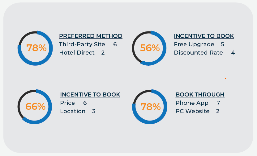
IMAGE: Closed question stats, booking program.
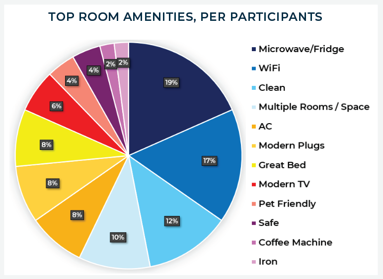
IMAGE: Top Room Amenities, booking program.
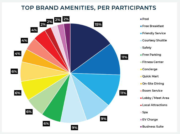
IMAGE: Top Hotel Brand Amenities, booking program.
RESEARCH THEME 3
- TOP USABILITY ISSUES, PER PARTICIPANTS
- ● Highlighted issues with clarity of information.
- ● Too much information.
- ● Poor iconography (use & size).
- ● Ease of fully understandable booking process.
- ● Visibility of loyalty program benefits.
- COMMON SUGGESTIONS, PER PARTICIPANTS
- ● Clearer error messages.
- ● Simplified layouts with less distractions.
- ● Intuitive clickable link areas.
- ● Better visibility of loyalty program features.
- ● Better label for “About Bonvoy,” as it was somewhat confusing.
PERSONAS
Two personas were created from the research conducted. Primary persona Andrew & Secondary persona Maria. Details on these personas & their needs can be found in the Hotel User Research Project Report PDF.
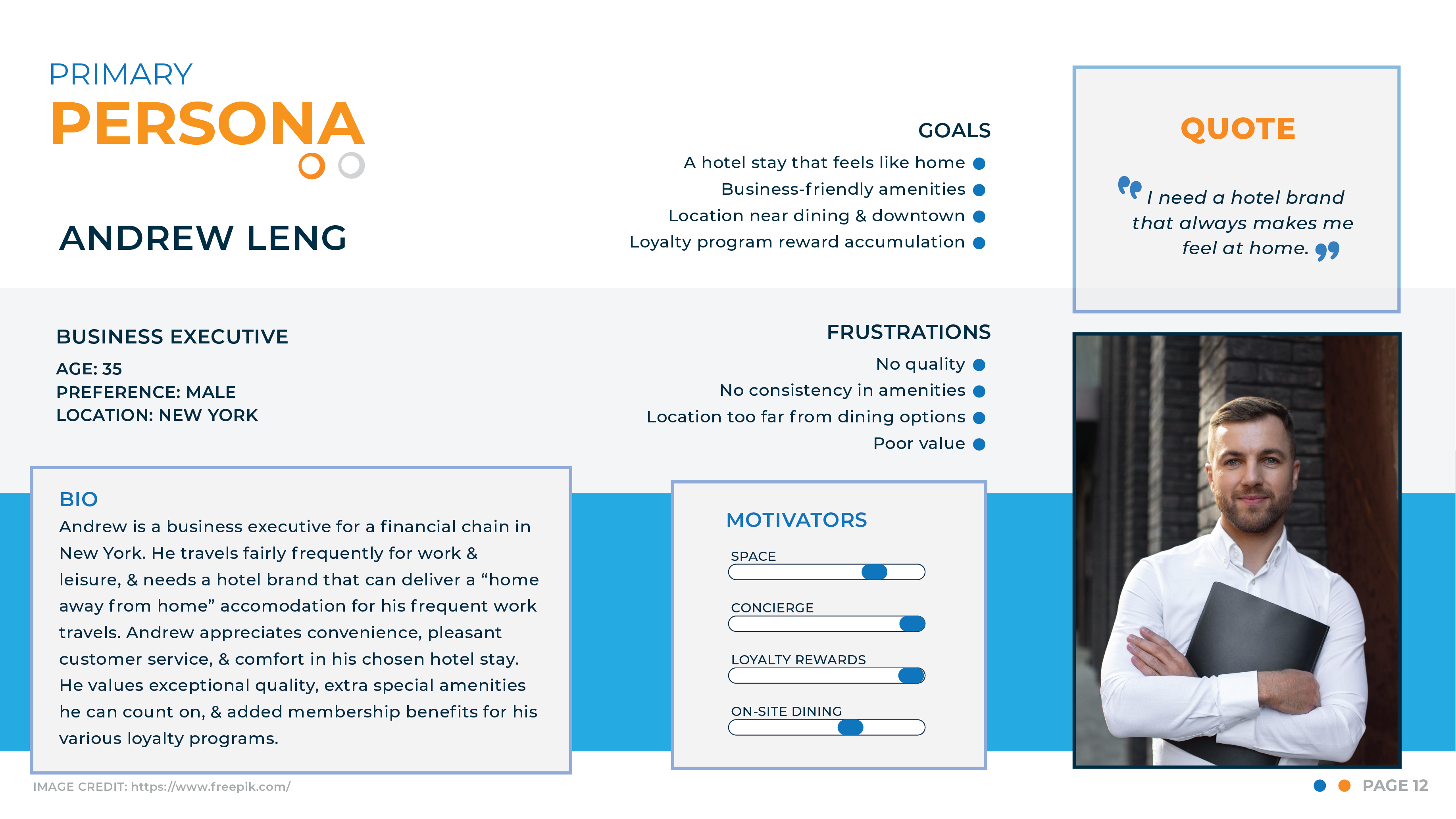
IMAGE: Primary persona Andrew.
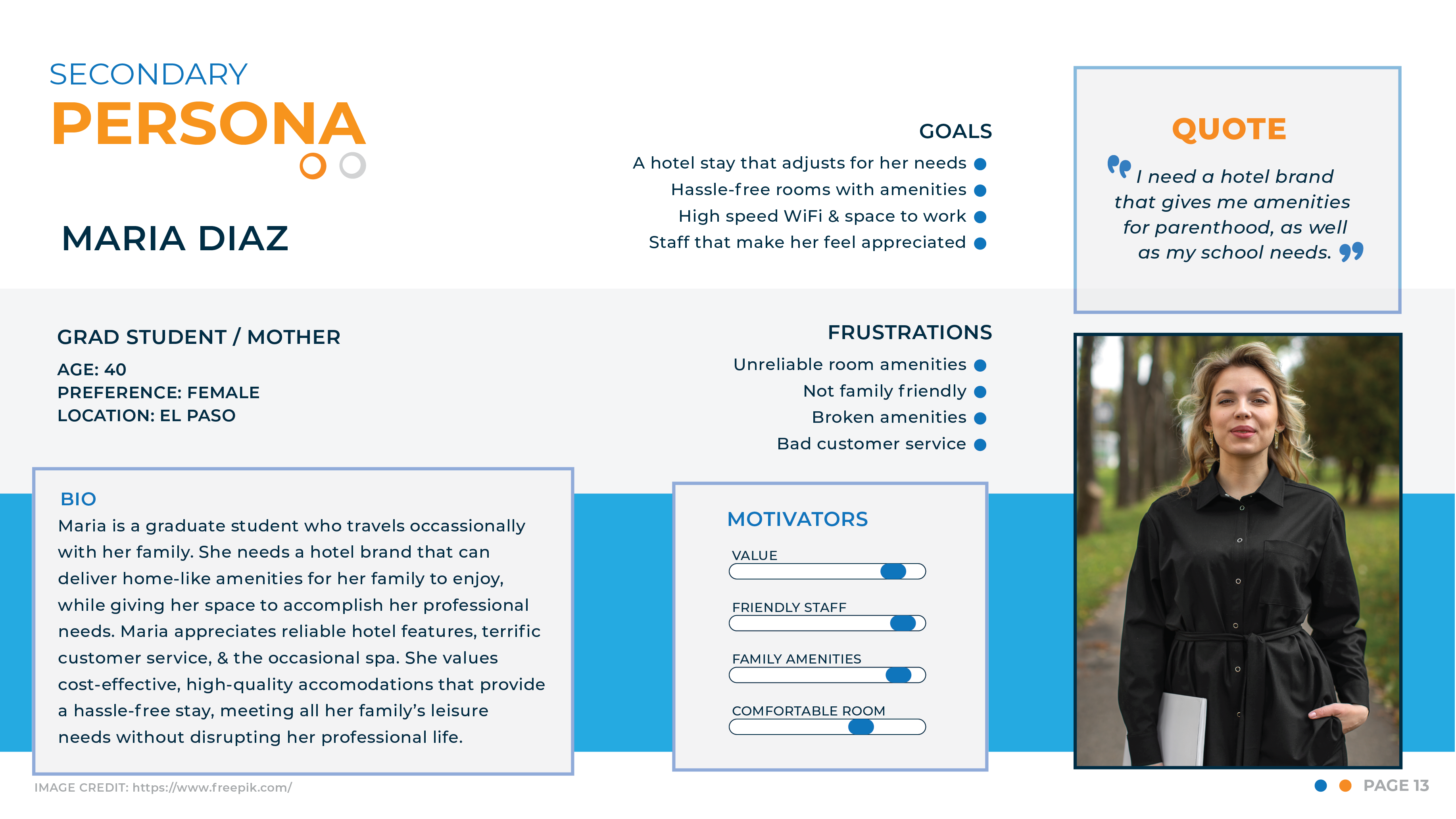
IMAGE: Secondary persona Maria.
JOURNEY MAPPING
A journey map was created for primary persona Andrew. It is also included in the Hotel User Research Project Report PDF link.
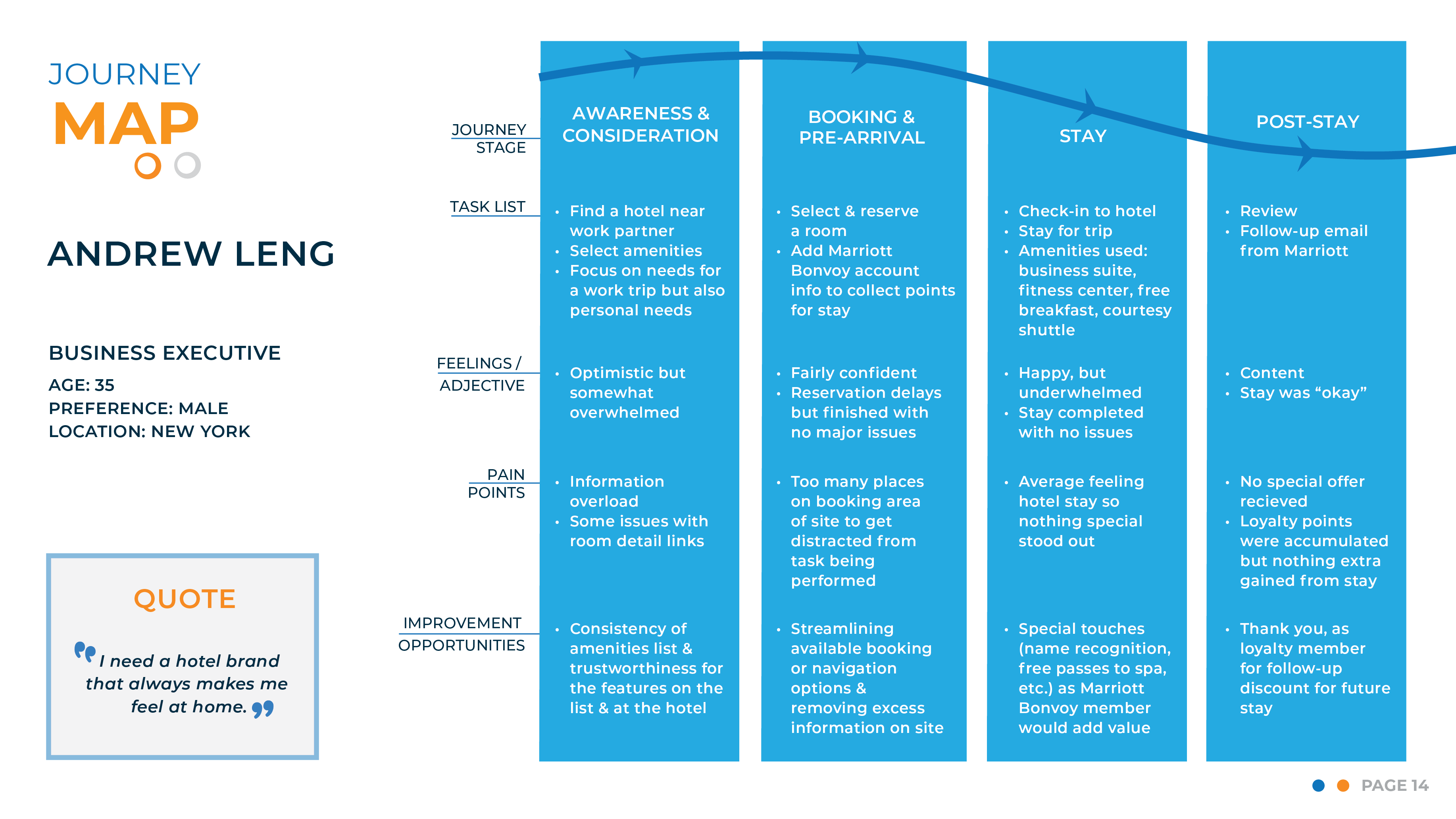
IMAGE: Primary persona Andrew's journey from searching for the perfect hotel, to after he checks out of his booking.
RESULTS
The full HOTEL USER RESEARCH REPORT PDF can be viewed by clicking the link below. Key final recommendations for all research themes are seen below this link.
THEME RECOMMENDATIONS
RESEARCH THEME 1
- TOP LOYALTY PROGRAM BENEFITS, PER RESEARCH*
- *Source: HERE
- ● Free suite upgrades.
- ● Dining credits.
- ● Platinum status upgrade.
- ● Free bonus stays.
- ● Airline benefits, via connecting affiliations.
- COMMON SUGGESTIONS, PER PARTICIPANTS
- ● VIP Parking.
- ● Simplifying program layouts / sections.
- ● Unified program page where all loyalty links go.
- ● Better visibility of loyalty program features.
- ● Better label for “About Bonvoy,” as it was somewhat confusing.
- ● Replace Home Page logo link with a logo that does not include “Bonvoy”.
RESEARCH THEME 2
- TOP BOOKING AMENITIES, PER RESEARCH*
- *Source: HERE
- ● On-site Dining / Room Service.
- ● Fitness Center.
- ● Free Wi-Fi.
- ● Pool.
- ● Spacious Rooms.
- ● Valet Parking / Parking.
- ● Bathrobes & Slippers.
- ● Nightly Turndown.
- ● Free Breakfast.
- ● Business Suite.
- ● Free Toiletries.
- ● Meeting Room / Lobby Area.
- COMMON SUGGESTIONS, PER PARTICIPANTS
- ● Clearer error field messages.
- ● Simplified layouts with less distractions.
- ● Intuitive clickable link areas with hierarchy formatting.
- ● Adjust sizing of “View Room Details” link.
- ● Images in hotel list click to go to hotel.
- ● “View Rates” CTA button label changed to “View Rooms.”
RESEARCH THEME 3
NAVIGATION & USE CLARITY ISSUE 1
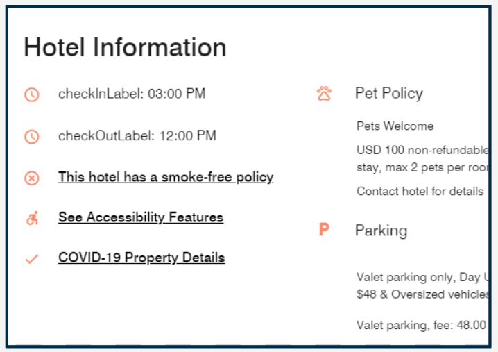
IMAGE: "checkInLabel" & “checkOutLabel” coding errors.
- ISSUE
- ● "checkInLabel" & “checkOutLabel” coding errors.
- ● Poorly contrasted & ineffective iconography.
- RECOMMENDATIONS
- ● Adjustment of coding errors resulting in misunderstood user labels.
- ● Removal of unnecessary & distracting iconography.
- RESULTS
- ● Less user frustration & distraction from user journey.
NAVIGATION & USE CLARITY ISSUE 2
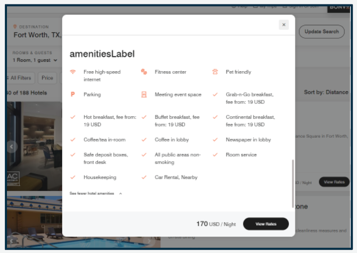
IMAGE: "amenitiesLabel" coding error.
- ISSUE
- ● "amenitiesLabel” coding error.
- ● Poorly contrasted & ineffective iconography.
- RECOMMENDATIONS
- ● Adjustment of coding errors resulting in misunderstood user labels.
- ● Removal of unnecessary & distracting iconography.
- RESULTS
- ● Less user frustration & distraction from user journey.
NAVIGATION & USE CLARITY ISSUE 3

IMAGE: "About Bonvoy” link label & term “Bonvoy” unclear to some participants.
- ISSUE
- ● "About Bonvoy” navigation label is unclear.
- ● Participants found “Bonvoy” name confusing.
- RECOMMENDATIONS
- ● Adjustment of misunderstood navigation label.
- ● Suggest changing label to “Marriott Loyalty Program”.
- RESULTS
- ● Less user frustration & distraction from user journey.
- ● Increased knowledge & possible new membership for program
NAVIGATION & USE CLARITY ISSUE 4

IMAGE: Improving accessibility of field error messages & improving color contrast for better accessibility.
- ISSUE
- ● Error message is only noticable by a small icon & use of color.
- ● Error message is easily overlooked, resulting in user frustration or inability to understand message.
- ● Actions required to remove error & proceed are unclear.
- RECOMMENDATIONS
- ● Adjustment of coding to make error icon larger.
- ● Adjustment of coding to make error field bolder & noticable by sizing contrast.
- ● Clarify error message to be easier to understand.
- RESULTS
- ● Less user frustration & distraction from user journey.
- ● Increased accessibility for all audiences & better SEO.
NAVIGATION & USE CLARITY ISSUE 5

IMAGE: 401 Authorization error encountered during possible daytime site maintenance.
- ISSUE
- ● "401 Authorization Required” error is unclear.
- ● Error produced frustration with user as they had to wait for it to refresh & log back in again.
- RECOMMENDATIONS
- ● Perform site maintenance outside busy hours.
- ● If error is result of coding issues, correct the code.
- RESULTS
- ● Less user frustration & distraction from user journey.
- ● Continued site usage rather than user leaving site in anger.
NAVIGATION & USE CLARITY ISSUE 6
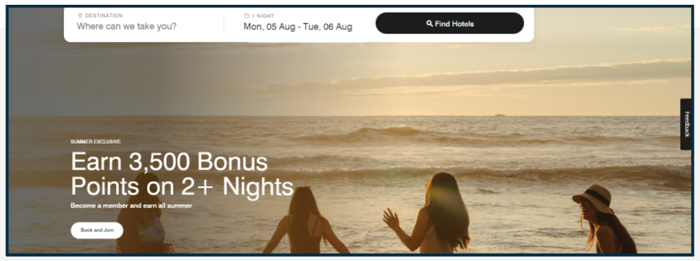
IMAGE: Hero image has accessibility issues. Some hero content & CTA (Call-To-Action) button labels need to be more effective.
- ISSUE
- ● Sizing of Hero ad is very large & doesn’t always resize well.
- ● User gets different Hero ad each page load but has no way to manually toggle through these ads (accessibility issue).
- ● CTA (Call-To-Action) button labels are unclear or ineffective.
- RECOMMENDATIONS
- ● Adjustment of Hero sizing to fit screens better (too large).
- ● Adjustment of Hero image needs accessibility arrows to be able to manually direct through rotating hero ad images.
- ● Clarify CTA (Call-To-Action) button labels.
- RESULTS
- ● Less user frustration & distraction from Hero ad space.
- ● Increased accessibility for all audiences & better SEO.
NAVIGATION & USE CLARITY ISSUE 7
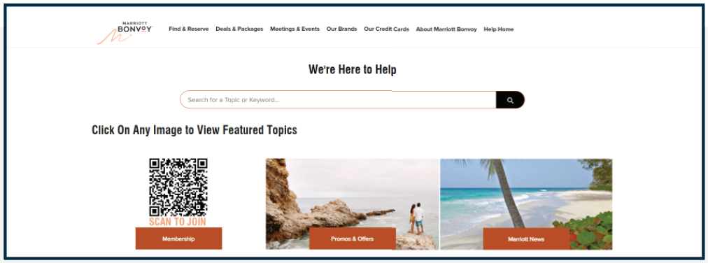
IMAGE: “Help” page needs an immediate phone response option at top. Some users felt the lack of immediate customer service felt unreliable.
- ISSUE
- ● Sizing of content sections are very large & don’t always resize well.
- ● “Help” page needs an immediate phone response option for questions that cannot wait for an email response.
- ● Help options do not feel all-inclusive (accessibility).
- RECOMMENDATIONS
- ● Adjustment of content sizing to fit screens better (too large).
- ● Addition of immediate ways to get in touch with “Help” (Customer Service).
- ● Clarify if all content is needed or organized effectively (follow-up study).
- RESULTS
- ● Less user frustration & distraction from getting help needed to reserve a room or join loyalty program.
- ● Increased accessibility for all audiences & better SEO .
NAVIGATION & USE CLARITY ISSUE 8
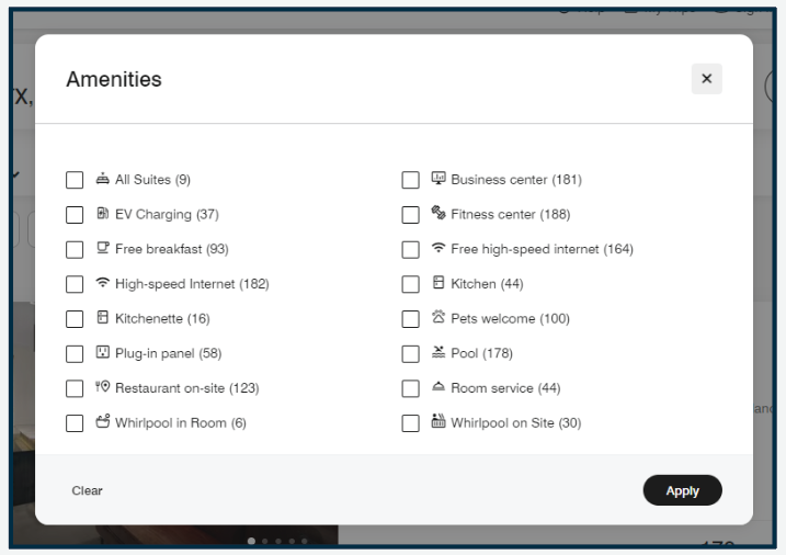
IMAGE: Excessive, unnecessary, & ineffective iconography.
- ISSUE
- ● Ineffective iconography.
- ● Poorly contrasted color choice & sizing of icons.
- RECOMMENDATIONS
- ● Adjustment of color & sizing for iconography.
- OR
- ● Removal of unnecessary & distracting iconography.
- RESULTS
- ● Less user frustration in user journeys.
- ● Cleaner option selection resulting in less distraction from room booking.
NAVIGATION & USE CLARITY ISSUE 9
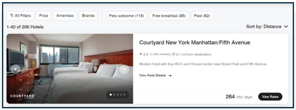
IMAGE: Clicking the hotel image results in no link. Hotel must be selected ONLY by the title or the “View Rates” button.
- ISSUE
- ● Clicking the hotel image results in no link.
- ● Hotel can be selected ONLY by the title or the “View Rates” button.
- ● “View Hotel Details” link is too small & thereby unclear or ineffective.
- ● “View Rates” label does not make sense with rate displayed next to it.
- RECOMMENDATIONS
- ● Addition of photo image as a link to select hotel
- ● Sizing of “View Hotel Details” needs adjusted to unify message with other options.
- ● Adjust CTA (Call-To-Action) button label “View Rates” to “View Hotel."
- RESULTS
- ● Less user frustration & distraction from hotel selection.
- ● Increased accessibility for all audiences & better SEO .
- ● Clarity of message & user journey to book room.
OTHER RECOMMENDATIONS
In conclusion, the recommendations from this report will help improve customer experiences & promote corporate expansion, which is desirable to the brand.
- OTHER MODIFICATIONS (NOT PICTURED)
- ● Removing the coding that makes the global navigation bar “jump.” This feels untrustworthy to some participants & feels like something is wrong with the page.
- ● Lessen section content on all main navigation pages. It is distracting & the user gets lost periodically. This will improve load times & SEO.
- ● Run tests on global header navigation & improve labeling. Most interviewees did not use this navigation bar to perform tasks.
